See a Pattern?
John Haberin New York City
Valerie Jaudon, Peter Young, and John McAllister
Pattern and Decoration sounds less like a movement than a department at Bed, Bath, and Beyond. And indeed it was always loosely bound, like a blanket. Was it about recovering craft for fine art or about making room for abstract art after Modernism? Was it getting past labels like "women's work" or yet another excuse to dismiss women? What if key figures were men?
Maybe it also masked a tension: pattern suggests discipline, while decoration suggests overflow. Valerie Jaudon still shows the commitment behind the exuberance, while Peter Young, not often mentioned in the narrative, approaches early on the garish side of test patterns via Minimalism. Maybe by now, too, younger artists like John McAllister no longer need to take sides. Related reviews turn to Fred Tomaselli, Philip Taaffe, and Robert Kushner, who has no qualms about papering the walls. 
Out of "WACK!"
I hardly expected to see Valerie Jaudon, along with Louise Fishman, in a show of feminist art, but I left a show at MoMA PS1 some years back half-wondering where she had been. She came of age in the 1970s, like Hilary Pecis, with the style quickly dubbed Pattern and Decoration. "WACK!" considered it very much a part of its "feminist revolution." Her work may not conform to anyone's idea of woman's work, not even that of its champions. Some of it may even reverse her own, with the background at times shifting from bare canvas to black. Yet it could not be more recognizably hers.
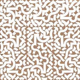
For Joyce Kozloff or Miriam Schapiro, "mere decoration" could borrow the materials of fashion or craft, offer a lyrical update of folk art, or explode into images from nature. Jaudon works in oil, prefers control to lyricism, and explodes only in the prepared mind. Like her 2005 show, a recap of decades of work centers on work sticks to her favorite color, white, and on geometric abstraction. It may, wrongly, look impersonal in reproduction, where one cannot experience the scale, the brushwork, or especially all the bare linen. She might even do the rigor of her male predecessors one better. Where Sol LeWitt begins with a set of rules and ends with something unruly, Jaudon starts with marks that may run every which way and none, only to end with a grid.
Both involve a process of scaling up. Jaudon appears to use a fairly wide, loaded brush or a palette knife. The individual marks add up to well-defined lines or curves, perhaps twice again as wide. They could pass for doodles, except that they run only horizontally, vertically, or diagonally. They also have absolutely hard, unpainted edges, like a mitered maze by Frank Stella. In 2008, the doodles consistently divided the canvas into nine equal square sectors, like a tic-tac-toe board, but never quite interrupting her characteristic Byzantine patterning.
Here, too, one can hardly miss the grid, even in a thumbnail, but one has a hard time pinning it down up close. The doodles may stop abruptly after a few inches or wander across the grid, with or without a break. (That with or without is consistent within a painting.) At other times they abruptly change direction at a break as if in a mirror—or a Crosshatch painting by Jasper Johns. Just two years before Jaudon had her first solo show, Jasper Johns called one of his first in the series Weeping Women, in 1975. Try not to shed tears.
She could seem to have reversed course, as a strategic retreat after years of more obvious patterns in color. She could also seem to have ditched the very Islamic or Gothic echoes that made her famous, in favor of something more conceptual and respectable. She has, in sum, settled for (yikes) abstract painting. Jaudon does not share the anxiety of broken symmetries for Johns. However, just when so many, including feminists, are complicating the story of painting after the death of painting, so is she. She does it by reasserting continuities, but also by an insistent sensuality.
In person the grid weaves in and out of consciousness like Op Art or like color for Ad Reinhardt amid Reinhardt's approach to black. When the white slims down to thin curves against black, it becomes not so much starker as more luminous. When it returns to thicker curves against bare canvas, brushwork rules. She lacks the ambition, complexity, and influence of some overtly feminist art. She is not using canvas materials to break down the divisions between fine art and fashion. However, all that exposed fabric has a weave of its own.
Young and restless
The death of Elizabeth Murray one August Sunday a decade ago recalled those already distant years when art had not yet grown so fashionable. Some wondered whether such things had a future—or deserved one. No wonder museums have been looking back recently with wonder. Big-ticket exhibitions have by now struggled with the millennium and a century of modern art, endorsed another round of emerging artists and "midcareer" trend setters, and paid their usual respects to those in between. Somehow, though, the last year and a half has seen something else instead. I mean an extraordinary concentration on the late 1960s and the 1970s.
Museums have looked at those who pushed large static structures past their limits, like Robert Smithson, Jennifer Bartlett, Eva Hesse, Louise Nevelson, and now Richard Serra. With Sean Scully and Brice Marden, as well as Ron Gorchov, abstract painting, too, found ways to continue when others had left it for dead. What has happened? No doubt museums need "Old Masters," and the official march toward another "greatest generation" simply reached the next decade. Perhaps, however, those years feel uncomfortably close to today. Then Modernism and its chroniclers had challenged artists to do something original, and now the art market does the same.
Obviously some artists back then managed to break boundaries, to extend traditions, or both. One could almost forget how the challenge weighed upon others, just as it did on my college friends a bit later. Could they paint like Frank Stella and Marden, and if so, could they make painting their own? If not, why? With Peter Young in 2007, P.S. 1 had in mind yet another saga of trials, persistence, and rediscovery. Instead, it exemplifies how so many artists poured their heart into draft after draft, in hope of leaving their signature.
Young, who also appeared in a show about the persistence of abstraction, starts minimally enough in 1963, with small paintings, dense patterns, and thick stretchers. Together, they all but shout "art object!" They look as if Josef Albers had taken up Joseph Cornell boxes. Before long, however, the artist still in his mid-twenties is seeking a way out. He tries to let the ground mean as much as the figure, by stripping out the color, stripping down the all-over pattern, and setting it loose. White dots cluster and meander across black canvas and vice versa, like Damien Hirst but with LSD in place of irony.
Not that I am accusing Young of harboring illegal substances. His next, more Zen-like creations, though, seem just right for the "summer of love." Here he lays thin, unevenly spaced horizontal and vertical black lines over light blue acrylic, to him the color of open sky. In reproduction more than in the original, the blue shades into white as if touched by sunlight. Not that their spareness lasts long either. Within years Young turns for inspiration to Rorschach tests and to the native culture of Costa Rica. He is seeking other antecedents and psychological currents in late Modernism's fearful symmetry.
Things keep getting messier for a while. Then the dots come back, sometimes as acrylic beads, not quite as calm or as restless as before, but in search of a literal middle ground for painting. And then, in 1977, the story ends, without so much as a happy ending. No stage in those thirteen years ever convinces me. However, their constant changes alone tell a story, and so does their dead end. It could be the story of someone I know.
Ranting and radiant
When John McAllister calls his work Serene Raving Radiant, maybe he just cannot make up his mind. Or maybe for him the road to wisdom is paved in excess. He leapfrogs right over Miriam Schapiro and "Pattern and Decoration," to a collision of vision and the decorative arts at the root of Modernism. He cites as an influence the Nabis in Paris of the 1890s, such as Pierre Bonnard, Félix Vallotton, and Maurice Denis. Then again, he bursts out of their often forbidding interiors, to imagined gardens and oceans. Then, too, his ambiguously wide open spaces may copy more directly another who outgrew their circle, Henri Matisse.
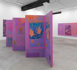
 Serene? Radiant? No promises here, not when his colors run to close shades of pink and violet. Not, too, when three canvases take up a wall apiece, while confusing inside and out. Flora appear as natural growth and as potted plants—and as paintings, postcards, and wallpaper. The largest fields, framed by patterned triangles, may open a further window onto nature or art.
It was Denis who set the stage for puzzles like this, when he wrote that "a picture—before being a battle horse, a nude, an anecdote, or whatnot—is essentially a flat surface covered with colors." And it was Matisse who covered a wall with rhythmic patterns of figures and plenty of red. In coming to the mural scale of postwar abstraction, Jackson Pollock and others were thinking more of Pablo Picasso, who had broken out of his customary dimensions with Guernica (which so influenced Pollock's Mural as well). Still, Matisse had been there long before with The Dance. McAllister just ditches the figures in search of the rhythms and the reds.
He also looks to Japanese art when he arranges a fourth work as a folding screen. Yet if multiculturalism is newly fashionable, Nabis does derive from a word in Islamic tradition, for prophet. (Take that, Donald Trump.) Here, too, McAllister borrows loosely, constructing his screen with the thickness of a conventional stretcher and with conventional hinges. He also paints on both sides, so that wherever one stands the conflicting vistas from point to point and painting to painting will not go away. He never does capture the rhythms, in color or design, but he does make the most of the conflicts.
The previous show at the same gallery did favor spareness, with oil stick and gentle curves. Tamuna Sirbiladze also likes to move between abstraction and a cartoon-like representation, itself already a convention, as with bags of money on mostly parallel lines and plain white. McAllister is more into raving. At his most serene, water plants and postcards sway together. More often, one can just try to figure out what lies where and what frames what. Not often enough, he is ranting and radiant.
Ryan Mrozowski offers another take on nature and decoration, with the stress on optical activity. Three canvases side by side show much the same oranges and leaves, skillfully rendered. Are they identical in pattern? Not at all, but one can hardly help trying to match them up only to watch them move. A similarly tropical surfeit extends to flowers and polka dots. Two sketchier birds, perhaps aspects of a single creature, share much the same profile and a single eye—but then who is counting?

Valerie Jaudon ran at Von Lintel through April 12, 2008, and at D. C. Moore through October 10, 2015. Peter Young ran at P.S. 1 through September 24, 2007. John McAllister ran at James Fuentes through December 20, 2015, Tamuna Sirbiladze through November 8, and Ryan Mrozowski ran at On Stellar Rays through December 13.


