Tearing Up the Catalog
John Haberin New York City
The Edward R. Broida Collection
What is painting all about anyway? And why would anybody want to know? The Edward R. Broida collection still wants answers.
When questioning art mattered
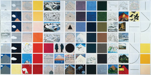
The questions mattered a great deal in 1976, when Jennifer Bartlett covered the walls of her Soho gallery with nearly a thousand steel tiles and called it a painting. Fifteen years later, the questions had taken on a nastier edge. Rhapsody had vanished into private hands, and irony ruled in public. Women were appropriating soft materials, parodying a decidedly male repertoire, or making art from their own bodies. Why, then, would anyone want to know?
 After yet another fifteen years, now that anything goes, I hear those same questions, but now in the tone of a pleasant shrug. Oh right, painting. I could handle that. Straight up, with a twist.
So, for once, can MoMA's atrium. At its simplest, painting—or at least Bartlett's—is about, oh, 987 square feet, and it spreads across the three walls as if Yoshio Taniguchi had designed them for her. Further selections from the Broida collection, dubbed "Against the Grain," take up the contemporary galleries, on their way to entering the museum's permanent holdings.
They may not define painting's future. The may not even define the museum's. They may not overflow my consciousness like Rhapsody. They leave far too much out.
However, for once the display of a private collection does more than plaster a wealthy donor's name on museum walls. Like the questions, the exhibition captures a moment or two in recent history, as a catalog of painting's possibilities found itself torn to shreds.
It also highlights the Modern's claim to extend its official history of modern art into the present. Maybe, too, it allows works like Rhapsody their place less as a final answer to anything and more like that glorious title.
Rhapsody in red, yellow, and blue
As a college senior in 1976, I definitely wanted answers. And I could have looked to places a lot worse than Paula Cooper gallery, where Jennifer Bartlett had taken over the joint. Friends were finding their idols in Minimalism's hard, stubborn objects, in Eva Hesse for the softer but no less disturbing ones of her Expanded Expansion, in Frank Stella for his logic, and in Robert Smithson for his appeal to chance and entropy. They were also hot on the trail of post-structuralism, and yet somehow they maintained a faith that abstract painting encompasses all of this. Worse, I could not follow a single piece of the puzzle, which no doubt accounts for my reductive capsule history. It also made me that much more eager to fit the puzzle together for myself.
Bartlett broke things down still further, into 987 painted pieces, looking ahead to walls of clock faces for Laura Owens. Many came with a finer division still, into a grid resembling graph paper. She offered an inventory of painting. She also promised a vision of painting, assembled from the ready-made parts in her self-created catalog. That vision drives many an artist between realism and abstraction today.
Already one can see the elements of style back then—the solid objects, their flatness, the elements of line and color, the grid, and a meta-grid large enough to reflect on them all. At times her graph holds single daubs of primary color, at times black shapes out of high-school geometry. At times, too, lines take on the form of something still more elementary, the stick-figure icon of a house. She might almost have produced the alphabet for what Nelson Goodman, a philosopher, has called "languages of art." In Hebrew, in fact, the second letter of the alphabet means and perhaps represents a house.
Sometimes each tile functions independently, sometimes a group of tiles runs through one set of permutations, and sometimes the image cuts across a grouping. At the work's center, the elements come together into a larger, if no less primitive house. Bartlett tempts one to interpret the color as landscape, the dominant white enamel as air—by turns chilly or luxuriant. Although the enamel on steel only looks like ceramic tiling, she tempts one, too, to think of architecture and design. She also tempts one to see the work coming together as a summation.
The display at MoMA should disabuse me of all that forever. Unlike Bartlett's "Hospital" in pastels, One cannot "read" the work from left to right or outside in. Rhapsody returns to solid, black shapes near the start of the third wall, just when one might have thought that one had learned the language. Immediately to the right of the large house, spots of color multiply into chaos—and even the illusion of motion. Just to the left, Bartlett disrupts the grid by omitting a few tiles, and the rest there gather into a wavy line as if of their own accord. The empty house itself invites one to locate the landscape in the space between the walls, so as to fill it with other presences.
Someone, in other words, has to feel rhapsodic, perhaps even me and you. And that someone could be forming new sentences, a times in still another language. The work casts doubt anyway on the familiar terms for art back then. Do all those marks belong to logic, "pure" painting, Pattern and Decoration, or the cartoon brushwork of Pop Art? Have they catalogued them all, or have they torn the catalog to shreds?
Vocabulary building
At the time, perhaps, this further question suggested a resolution. It seemed to consider every issue on the table, and it invited the parties to transcend their differences. In retrospect, however, it disrupted the negotiations, and art was about to make the parties look a good deal less relevant. Between new media, new-image painting, neo-geo, and neo-expressionism, everything had to start with a word new that really meant old. Pattern and design now had to relate to social, political, and feminist contexts—the very contexts that Bartlett's house apart from a community seemed to exclude. If Rhapsody pretended to exhaust the possibilities, others saw painting itself as exhausted.
Maybe not, but it sure felt that way, when Soho galleries, including Paula Cooper, were packing it in and heading to Chelsea. It no longer feels that way today. At the Modern, Rhapsody really sings. More generally, the Broida collection helps revisit a moment in art as neither fully past nor present. Instead of a program for success or a dead end, the exhibition presents artists exploring the possibilities. The moment becomes a point of transition between late Modernism's assurances and present perplexities.
While Bartlett and I are cataloguing things, one can fit the exploration into just a few groups. Philip Guston and Bruce Nauman play the art's bad boys—or just bad enough to suggest that art was about to shake things up. Guston gets two rooms to himself. It includes one WPA-style study and one of his last abstractions, with a looming black blob that threatens at any moment to become a head. Mostly, though, it focuses on his late, representational art. His anxious body peeks through more than once, but one sees more casual humor than in his retrospective a couple of years ago, less of his heavy self-mockery, fewer pinks, and almost no sneakers.
Bartlett leads off a second group—what I might call art's vocabulary lessons. Susan Rothenberg has her simplest and perhaps most iconic horse. Joel Shapiro has an entire room of his sculpture and drawings, while Neil Jenney has just one of his bulky, framed paintings. Vija Celmins ranges between her images of disaster and of nature, all in delicate shades of black. Each artist here is playing at the line between abstraction and figuration, and each runs through variations on a theme. Exhaustion has plainly not set in, at least yet.
Other painters break more subtly with geometry, through a concern for the feel of oil. Jake Berthot, Harvey Quaytman, and Sean Scully have varying degrees of thickness, symmetry, and firm outlines. All, however, work somewhere between translucency and opacity, in order to give color fields a weight in themselves. I may well never use lapidary in a sentence again, but for Scully it comes in handy. He gives his matte colors and slightly rounded rectangles, separated by thin areas of color, the look of stone slabs. Again one can see art as rebuilding itself from elements, but not according to a clear recipe.
Finally, several are doing much the same for sculpture, including Ken Price, Roni Horn, Martin Puryear, Christopher Wilmarth, and Mark di Suvero. Wilmarth gets a particularly fine room to himself for his constructions of metal and frosted glass. While these date from as long ago as 1969, again they point to a particular esthetic and subject matter rooted in time.
Exhausting the 1970s
Call it, then, a portrait of art happily exhausting the 1970s and stumbling into the 1980s—and, by implication, to abstraction today. That can make it seem either old-fashioned or quite contemporary. It fits into the comfortable categories of painting and sculpture. It shies away from even the shredding of materials, as by Elizabeth Murray and Joan Snyder. It sticks pretty much to traditional media, except when Wolfgang Laib strews a field of rice around his rough, white marble house. Maybe Laib supplies the grain, and the rest of the show runs against that.
The Modern may call this "Against the Grain," but do not expect anything grating, much less shocking. However, it does not thereby glorify a generation or a taste. It does not do for the early 1980s what Dia:Beacon does for Minimalism. Museum displays of private collections almost invariably pander to the egos of potential donors, like the Nasher sculpture collection at the Guggenheim or the UBS collection, which got the Modern's new galleries off to a truly depressing start. I felt very little concern here for the art of corporate lobbies or contemporary celebrities.
It helps that the Modern, much as recently with "Take Two," has its big contemporary galleries increasingly under control along with Taniguchi's atrium. They allow the exhibition to start with Bartlett, flow into an arc of rooms for the main event, and slip off into side chambers for a few individuals in depth. It its last full public display, at Robert Miller in 1999, Rhapsody snaked through so many rooms that its elements resembled departments in a chain store. It helps even more, however, that the exhibition and the museum settle for representing one well-defined possibility. Many of Broida's holdings not fitting that possibility went instead for auction.
"Against the Grain" represents a time when it made sense to see contemporary art as largely an American affair. Young artists were hard at work, and the oldest on display, Guston, was just coming into critical favor. Perhaps Rothenberg's horses stride more boldly elsewhere and kick up more of a storm, if none have so many darkly suggestive shadows. Perhaps only Bartlett left a work that changes how I experience the art that surrounds it. Perhaps Rhapsody took painting apart, but after Modernism could all the king's horses put it together again? Still, change had to start somewhere, even before a generation of irony and appropriation.
Just as usefully, the show falls between stages in MoMA's own collecting. The main galleries famously march from Paul Cézanne and Pablo Picasso to Jackson Pollock and Jasper Johns, with only the most careful deviations from a straight line. Contemporary acquisitions can easily come as an awkward appendage. A conservative critic, Jed Perl, has indeed ordered those acquisitions to stop. Yet the exhibition shows once again how dual narratives nag at the Modern, just as they do at contemporary art. One can call Modernism a period in art history or a backdrop to the present, and that contradiction characterizes a vital "postmodern paradox." At its best, the Broida gift helps bridge a temporal gap enough to let the conflict and contradiction take shape, a bit like a nearly concurrent seventy-fifth birthday party, "Full House," at the Whitney.
In this version of the gap, minimal need not equate with logical, nor expression with excess. Two floors up, William Tucker's large wood and metal sculpture concludes the exhibition with an even simpler A-frame than Bartlett's. He calls it House of the Hanged Man, after a painting by Paul Cézanne. It could stand as a suicide note from Modernism itself. Out in the atrium, Modernism hangs itself once and for all, but art keeps parsing its last words.

"Against the Grain: Contemporary Art from the Edward R. Broida Collection" ran at The Museum of Modern Art through July 10, 2006. Separate reviews look at Jennifer Bartlett again, in later work and a retrospective.


