Abstract Determination
John Haberin New York City
Stanley Whitney, Jack Tworkov, and Louise Fishman
For every emerging artist gaining the spotlight, an artist somewhere else just keeps plodding along. And who is to say which takes more determination? In pairing Stanley Whitney with this year's artists in residence, the Studio Museum in Harlem shows its commitment to both.
Jack Tworkov and Louise Fishman have even more of a claim to present attention, if only because they never quite left. Tworkov was in all the right places, except maybe the textbooks, while Fishman stood apart as a feminist and a woman. He did everything he could to change with his times, while she kept rediscovering gestural abstraction as if for the first time. In fact, she may still be coming into her own. Together they ask what it takes to take abstract painting into the mainstream. They may not have changed their times on their own, but they make clear why exhibitions keep discovering them year in, year out. 
Just plodding along
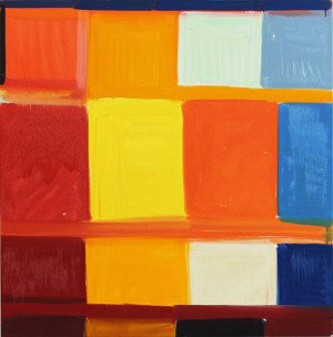
In pairing a neglected standby with emerging artists, the Studio Museum looks at both sides of the spotlight. People lamenting the ill effects of money in the art world can easily forget how much it needs both at that. The museum picks up Stanley Whitney in 2007, already in sixties, and follows him to today. He shows few if any signs of change in eight years, maybe because he knows by now what he is doing. He still paints with few obvious signs of premeditation. Yet he also still sticks to abstraction and the grid.
His very method is a kind of plodding along. Whitney lays down rectangles, one by one, working from top left to bottom right. If you remember them and an entire canvas as squares, fine, for he is not one to let composition stand in the way of color—bright color at that, with only an occasional black. Along the way, he stops to separate rows with horizontal bands almost like single brushstrokes, although Whitney uses as many as he needs, no more and no less. Fewer than a dozen large canvases fill the two main galleries, along with six smaller paintings of identical dimensions but years apart. The show speaks to an entire career as a handful of works in series.
Not that Whitney seems all that concerned for systems. In a time of a revival of Minimalism amid painterly excess, he keeps pretty much to himself, at the cost of not always thrilling or inspiring. He stands apart from the conceptual side of Minimalism, but also apart from the fuss. The painted fields may overlap or not, without disturbing his signature. Even his regular working method has spontaneity built right in. Nothing decides the height of the next row, the direction and visibility of its brushwork, or the next color in the grid but him.
Works on paper, included as well, are not strict plans for paintings, but series on their own. The ones in black and white allow the borders of the grid to speak for themselves, and they wiggle. The ones in color bring in white as paper or ground. The paintings approach architecture, with the color as brickwork and gesture as mortar, like Sean Scully without the sobriety and density. Even the titles imply a degree of whimsy. Not entirely ironic odes to African American culture, such as James Brown's Sacrifice to Apollo, co-exist with Dance the Orange—a quote from the Sonnets to Orpheus by Rainer Maria Rilke, on the transformation of one art or sensation into another, that also supplies a title for the show.
As Friedrich Nietzsche said, "I would only believe in a god who can dance." Sometimes Whitney could do with a little more dancing at that. A renewed interest these days in older artists and black abstraction comes as a welcome relief. Still, the pressure for rediscovery, like the pressure to discover the next emerging artist, has its roots in the market. These paintings are more delicious than individual, for all the pleasures of plodding along. They also face plenty of competition.
I write so much about abstraction because of my biases, but also because there is so much out there—much of it playing at once with geometry and gesture. Maureen McQuillan's grids on the Lower East Side the same summer really do wiggle, in painstaking layers based on digital display systems. Tom Kotik's cross multiple canvases, so that they may or may not line up, depending on where one stands. Maria Walker, Heather Hutchison, and Stuart Arends at the same gallery turn Minimalism into a layering of materials, including the back of unprimed canvas, Plexiglas, and corrugated plastic. Each has a distinct luminosity and care for detail, while Whitney would much rather think big, but do make room for both. "Exquisite," Rilke wrote, for "it's been transmuted into you."
All the right places
Talk about all the right places. Jack Tworkov came to New York from the Russian Empire (Poland, to you) in 1913, when Jackson Pollock was a newborn out west and Tworkov himself was thirteen. He studied at the National Academy of Design and, like Adolph Gottlieb, at the Art Students League, and he helped organize the 1951 9th Street exhibition that put the New York School front and center. He worked the next year alongside John Cage and Merce Cunningham at Black Mountain College, where his students included Robert Rauschenberg and Dorothea Rockburne. He chaired the department at Yale in the 1960s, when it meant something—and where he taught Jennifer Bartlett, Chuck Close, Nancy Graves, Brice Marden, and Robert Mangold. Never mind what you think of Yale as a career move today.
Stylistically, he was in all the right places, too. Tworkov first summered in the artist's colony at Provincetown in his twenties, and he died there in 1982. A painting from 1931 shows the piers in sunlight, with the sober realism of an older American art but with visible brushwork and cube-like sheds out of Paul Cézanne and Cézanne drawing. In a still life, he pares back, with more white and a greater approach to Cubism, like Henri Matisse crossed with Stuart Davis. White persists into an abstraction from 1951, with acid yellows out of Willem de Kooning. By the decade's end, crayon and brush are darting up and down in reds and blues, much as for Helen Frankenthaler.
 He is also looking for new ways to stay in motion while paring back. Canvases darken to explore the rectangle, like black paintings for Rauschenberg. Diagonals appear, most notably in the 1970s, creating compound geometries. Based often as not on a rhombus, they suggest a foreground object and a theme, like folds for Rockburne. Short but thick curls cover them in muter tones, bringing the entire composition back to its surface, like geometry as gesture for Mangold or for Marden. By the very end, diagonals provide the only trace of the brush, and geometry has taken over for good, but as motion. Tworkov thought of them as knight's moves without a chessboard.
His entire work can feel like gamesmanship of a high order, with others writing the rules. At each step, he hits on someone else's discovery just after the fact, even as he calls it his own. His really was a textbook career, from an artist comfortable in academia. He came late to painting itself, after studying English at Columbia University as an aspiring writer. As for so many great American artists, Cézanne and Matisse set him off, with Joan Miró to add the finishing touches. His very shift between styles has stood in the way of appreciation, for viewers who expect an artistic signature—and by his death painting, too, seemed dead, as if he had somehow managed to take it with him.
For all that, his influence was real, and exhibitions keep running into it. This is his third mini-retrospective in a decade, not one of them in a museum. The UBS tower in midtown had the larger one in 2008, while another gallery focused in 2010 on his paring back. One will and should remember him for the early 1970s, with the rhombus in the foreground and the quick curls everywhere as a grid to themselves, like a Pointillism in shades of gray. Oh, him, you want to say, and there is always someone better. And yet there is always him.
His very eclecticism makes him newly relevant, much as for a greater show-off in Albert Oehlen. What once seemed slow in coming may now seem interdisciplinary. If he started as a writer, he also collaborated with writers in the theater. Yet his strength still lies in discipline—the discipline it took to make a style his own. Color or design comes as a tool for what to him really matters. Look at black squiggles on paper, and one can almost see a de Kooning woman, but sex for him lies only in paint.
One stroke at a time
Louise Fishman wants you to take her work one stroke at a time. Even now, well into her seventies, she uses lots of them. Her paintings can stand more than six feet tall. Their marks thin out quickly into streaks—and then keep going. They have a consistent palette, leaning heavily on blue and gray, so that one is aware of the paint all the more. For all that, though, they are lighter than ever before.
The lightness starts with the palette, which can hardly help evoking sea and sky. It has its heart, though, as in the 2014 Whitney Biennial, in long verticals on largely open fields and in broader strokes brimming over the grid. Both give added prominence to the white of the ground. It penetrates the colors almost as if added last, as highlights. If it also recalls Joan Mitchell, Fishman may simply be returning to her roots. She grew up with Abstract Expressionism, and she has never altogether left it behind.
Make that second-generation Abstract Expressionism given her age, much as with Walter Darby Bannard, Lynne Drexler, and Sonia Gechtoff, and the label is not often a compliment. It could make her work seem out of touch even in her twenties, when Minimalism already ruled—although she experimented with that as well. It has also had people reaching for other labels instead. She has exhibited in context of gay rights and Judaism, although the work remained largely abstract. She has looked relevant again thanks first to Neo-Expressionism and then to Pattern and Decoration, although she is not neo anything, and she long had little concern for patterns. Her work has gained from its shifting context, but the context has shifted more than the work.
Still, one can locate a divide. In her earlier and more somber museum pieces, paint gathers thickly. Fields of it or thick black curves run up against one another or the edge. For a while, text intrudes as well, including a feminist's repeated cry of angry. One can think of the work as about paint more than design, like a novel that one reads more for the characters and the prose than the plot. One can also think of the paint as itself a sign, with no need for more.
The lightness is the biggest change in her art over the last twenty years, along with a greater acceptance of the grid. They go together, in fact. It takes the grid to make one this aware of where brushwork begins and ends. The interplay is most obvious in her latest paintings, and they are stronger for it. Fishman has spoken of taking her cues from the support, even if that means just the sheet of paper for a watercolor. She sounds like a formalist, but maybe she is only just becoming one. That makes sense, too, for painting more and more about process.
The process involves scraping as well as addition. That appearance of a single brushstroke is often an illusion, as for Alix Le Méléder. At the same time, the grid brings with it a palpable layering, as verticals and horizontals compete for the picture plane, while other colors break through like physical disruptions. Again subjectivity runs up against its limits—and vice versa. There is something quaint or embarrassing in talking so much about paint, and she might be the first to refuse. Yet one can still enjoy it, one stroke at a time.

Stanley Whitney ran at the Studio Museum in Harlem through October 25, 2015, Maureen McQuillan at McKenzie through August 15, Tom Kotik at Lesley Heller through July 11, Jack Tworkov at Alexander Gray through October 24, and Louise Fishman at Cheim & Read through November 21.


