Traffic in Abstraction
John Haberin New York City
Gallery-Going: Philip Taaffe and John Bauer
Julian Lethbridge, Jonathan Lasker, and Robert Mangold
Abstract painting was spreading again this spring, much like the rest of the art market. It has suspended irony long enough to look for forgotten ancestors. It has abandoned disciplined geometry for the exuberant darkness of pixels, urban traffic, and installations. It has sought the textbook to explain away modern art.
Philip Taaffe and John Bauer allow abstraction to look garish or even banal, especially in reproduction. Yet they have grand designs of their own. Julian Lethbridge recalls Abstract Expressionism as a kind of crazy quilt. Jonathan Lasker keeps it simple as a graphic novel, with squiggly black lines and bright impasto in place of the fight scenes. Have they put aside the rigor of Robert Mangold for good, or have they just told it how to behave? 
Totem and taboo
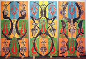
What do you get when you mix Op Art, drips, silkscreens, and Native American carvings? In the case of Philip Taaffe, you get aspirations to major abstract painting. This artist wants people to take him seriously.
Taaffe has not always evoked the big boys. In fact, he made a career taking them down a notch. He thrived before the alleged death of irony, with sickly hues and then some. His off-kilter pattern and decoration had more to do with Ross Bleckner, Robert Kushner, or late Richard Pousette-Dart or Pousette-Dart in 1951 than Abstract Expressionists like Pousette-Dart in white, much less the luminosity of the Pacific Northwest. The washes of saturated color beneath transferred images derived from Andy Warhol, but they held even Warhol and Warhol's influence at an ironic remove. Now, however, Taaffe is going for the knockout punch.
Taaffe is determined to awe. If that takes formal overload or a piling on of references, all the better. He works on a large scale, its vertical axis reinforced by the imagery itself, derived from totem poles. The repeated wheeling spikes could just as well belong to any civilization, however. If you share a politically correct concern for cultural imperialism, call it Native American. If you prefer something more fitting downtown, call it Tantric.
Taaffe can lay claim to ironic ancestors of a more recent sort, too. Warped or not, the patterns link his work to textbook abstraction. Adolph Gottlieb had totemic grids in the 1940s, and Sue Williams has been simulating Willem de Kooning in carpets of sex objects for some time now. Obscure, apocalyptic wallpaper fits with any number of younger artists, too, such as Matthew Ritchie. For good measure, one painting quotes Bridget Riley and Op Art. Perhaps Taaffe, too, finds staring at his art for long a bit nauseating.
I still see art with a short attention span. Is he too good at last for conceptual art or the other way around? Taaffe now has too many concepts to take any of them all that seriously. And none has Williams's sharp eye for art history and mass culture—or, for that matter, de Kooning's.
Taaffe can boast at once of irony and tradition, like a kind of John Currin for abstraction. He can just run his art up the totem pole and see who salutes. Does a jpeg render it bland, accessible, or meaningless. Does a viewer's memory? At least this art looks better than in reproduction.
Black and silver
So does John Bauer's. His abstractions looked so boring in the invitation that I almost skipped his show. I almost walked out in no time, too, because their black and silver seemed so garish. Luckily, the sheer disconnect in my own reactions held me. In that alone, Bauer is on to something.
Banal and ugly may not sound like a recommendation, but they sum up the old "shock of the new." For skeptics, modern art still offers a choice between wallpaper and human excreta. With Marilyn and urine, Warhol managed both. So, in a sense, did Jackson Pollock with drips alone. Now, when art has to try that much harder to shock, Bauer crisscrosses the surface with everything in the book. From digital graphics, with pixels the size of a small insect, he builds to stencils, silkscreens, and brushwork. I could almost understand why a gallery handout crams in practically every theoretical framework since Plato, as if desperate to keep up—or perhaps desperate to rescue painting from banality and ugliness.
Bauer appropriates late Modernism's appropriations, but not its defiant plainness. He makes it hard to know what one is seeing and which technique is which. I could see little reason the paintings could not hang backward or upside down, other than his signature at the bottom. Even so, this gesture appears in reverse half the time. Bauer's palette suggests another kind of reversal, too, that of a photographic negative. But what have these simulacra inverted and reproduced?
With his weave of black lines over bright lights, one could be looking at Times Square through the old iron frame of the el. However, Bauer's images refuse to coalesce, not even into a representation of chaos. Count the sinister, all-seeing networks and barred windows of Peter Halley and Robert Smithson's entropy as just more remnants of the past. Bauer gets away with a lot of echoes and a lot of debris without much variety or clarity, but perhaps that is their sense. Stranger still, after a while the unreal cities look halfway pretty. Who needs pure, banal, or ugly old abstraction anyway?
Actually, quite a few people, for the form is having yet another revival. As one sign of what is selling, Josh Smith with his cheesy replay of Helen Frankenthaler annd Frank Walter made it to Chelsea's fanciest block. Without even working on all that large a scale, he filled both rooms of his West 24th Street gallery with large, facile brushstrokes of thinly applied, bright color and no apparent shape. They looked as if he had executed them all one morning—because, as Bill Clinton might say, he could.
Come to think of it, such a performance might translate into terrific conceptual art one day. For now, however, one must settle for stubbornly cheerful decoration, churned out quickly for a premium market. It adapts painting for the same novice buyers who fawn over Jeff Koons and his balloon puppies. Hey, someone has to keep abstraction alive. At least someone has to claim credit for doing so, especially when it sells like hot cakes.
Carpet bombs
Julian Lethbridge and Jonathan Lasker, by contrast, paint like throwbacks. Both rely on thick surfaces, clean brushstrokes, and crystal clear patterns of assembly. They could be holding classes on past styles, one the strict schoolmaster and the other the irreverent student.
Lethbridge works earnestly, skillfully, and hard. Successive layers of paint define a shallow but active space. Interplay between drawing and painting gives the design breathing room. Lethbridge uses the same approach and the same muted palette each time. He thinks he knows Pollock so well that he has the formula, and it is a good one.
Perhaps only a Brit living in Connecticut could translate Pollock into something so sophisticated and worldly, if at times unfailingly polite. He probably works on the wall to avoid having to wipe off the hand prints or vacuum up the cigarette butts. Yet his reticence has its own interest: just when he approaches the unfashionable ideal of personal expression, he cannily draws back. At his best, too, the sharp horizontal edges of his tapestry-like loops ripple across a canvas in waves.
More than in years past, Lethbridge maintains three distinct layers. Variations of brown and tan supply the ground. A brighter middle layer has freer splotches, often spraying out on impact. On top, straight gray lines run perhaps a finger's width and a foot long. In the largest and best works, these crossing lines contain parallel traces of primary color, mixed wet on wet along the edge, as if casting a shadow. The thick field, dominant shapes, and reed-like palette pay due tribute to Pollock's Sounds in the Grass (A Shimmering Substance).
Sometimes I missed the substance and the shimmer—although six years later Lethbridge was to return with more black and his best show yet. And indeed all these artists offer a kind of crazy quilt, and Chelsea has plenty more to spare. Lisa Hoke fills a gallery with colored film stretched on open frames, as if a kite had cloned itself until running out of space. Simpler, if duller structures in the back room echo the Bauhaus. One room all but morphs into the other before one's eyes.
Meanwhile, Alyson Shotz calls her show "Infinite Space." For all its ups and downs, it literally does have a crazy quilt, a kind of origami or Cubist Persian rug. I admired how the folds make it both too fragile and too spiky to cross.
Abstraction: the graphic novel
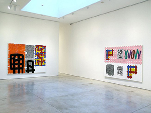
Like Lethbridge, Jonathan Lasker favors impasto in distinct lines. Ground, colored shapes, and monochrome drawing again amount to distinct applications. However, Lasker's lines run the width of a painting—or way longer. Bright red lines form a grid, while thinner black lines coil in on themselves like old string. Other shapes just go along for the ride. And all that leaves plenty of space for the bright white ground.
Maybe every artist wishes paint looked as good as right out of the tube. Lasker's appears squeezed out of a tube the size of a human being. In their simplicity, his designs suggest a cartoon without a subject. If Lethbridge offers a textbook version of Abstract Expressionism, Lasker creates the graphic novel. Perhaps the action figures saved painting and departed. Perhaps Lasker buried them in white, in honor of the death of abstract art.
While his installation may not look like a textbook, it has something in common with one. In 1976, when painting last faced a dead end, Jennifer Bartlett catalogued its elements and put them through their paces. In Rhapsody, her grid the size of a gallery gave painting back its childhood memories and a less pretentious future.  Lasker's open spaces, simple forms, arbitrary recombinations, and felt rhythms do something similar but less ambitious. They are hard to resist, but they do not manage to sum up the past or start over from scratch. Then again, textbooks are getting dumbed down, too.
I can see why an abstract painter might need a primer. This past fall saw retrospectives of Sean Scully and Brice Marden, like a stern warning to the present. This spring wrapped up "High Times, Hard Times," with quirkier selections from the 1970s. Where Taaffe looks past that to Pop Art or ancient history, Bauer looks away. Where Lethbridge looks back to late Modernism, Lasker looks right through it. Painting no longer has to make a point of staying alive.
Robert Mangold offers one last reminder of why. A degree of pomposity almost spoils his new paintings. Mangold calls them Column Structures I to XII, and the tall canvases with limbs here and there can hardly avoid associations with the stations of the cross. However, their hard edges and gentle curves show the difference between the past and a textbook history.
He gives his usual motif a lighter touch than ever. Each surface has a slightly different shape and color, none of them an obvious primary tone. A black, pencil-like curve loops its way freely across them all, with a particular awareness of edges. It shares something with Marden's curves, but it avoids Marden's density and spatial illusion. It creates a starting point for exploring them all.

Philip Taaffe ran at Gagosian uptown through March 31, 2007, John Bauer at Bellwether through May 19, Josh Smith at Luhring Augustine through April 28, Julian Lethbridge at Paula Cooper through April 21, Lisa Hoke at Elizabeth Harris through March 10, Alyson Shotz at Derek Eller through March 17. Jonathan Lasker at Cheim & Read through May 5, and Robert Mangold at PaceWildenstein on 22nd Street through March 10. I also draw on Lethbridge's return to the same gallery through February 16, 2013.


