Watch the Closing Doors
John Haberin New York City
Mark Grotjahn, Ron Gorchov, and Abstraction
Catherine Yass, Ellsworth Kelly, and Fred Sandback
Once abstraction represented the cutting edge. Now, it seems, artists cannot draw hard edges without a concept. First Pop Art and then computers have made discrete patterns look downright representational.
Maybe that helps account for traces of bilateral symmetry recently. Artists need no longer worry about purity. If one starts to imagine a human body or double doors, why not? Maybe the art will shatter those associations of its own accord. 
Fall 2006 had one after another strong showing of abstract forms. Credit it to dumb luck or a conservative art market. Sean Scully and Brice Marden have had retrospectives. Less magnificently, other artists focus on a vertical division of the picture plane. Mark Grotjahn gives it a California twist, Ron Gorchov harks back to its roots in formalism, and Catherine Yass puts it on video. If each makes me think of architecture, Ellsworth Kelly and Fred Sandback manage to break down the doors.
Iron-on Butterfly
For Peter Halley a generation ago, a predetermined geometry stood not for the cutting edge but for the surveillance camera and totalitarian prison systems. Even now, between homage to the past and acknowledgment of the present, associations beyond painting itself are sure to slip in. No wonder so many abstract artists trust to gesture.
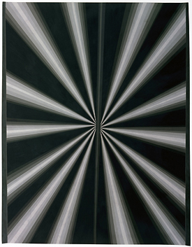
Yet Mark Grotjahn shuns associations with anything, even as he builds his own twisted double doors. His slim triangles, pressed tightly against one another, rule out nature in more ways than one. Tapering toward a work's central axis, but with dual points of convergence, they suggest perspective without a vanishing point. Up close, varied shades of gray can grow dizzying, and in a winter 2006 gallery exhibition in blues deepening into pitch black they have the shine and reserve of a mirror, but they never bulge like Rob de Oude into the three dimensions of Op Art. He calls them butterfly patterns, although they never flap their wings. Do not, however, expect the return of formalism.
Do not expect even its studied violation, as in recent Frank Stella, long after his "Black Paintings," or Jasper Johns with crosshatching. The patterns have no logical relation to the picture's edge. They may dip suddenly to converge at the bottom edge. They may leave arbitrary fields of white. The broken symmetry does not invoke philosophical meditations on the essence of the picture plane. In the gallery works, one spots a trickle of blue here and there, in the gap between diverging dark rays, as if to contrast pattern and drip, the artist's concept and execution.
Besides, Grotjahn revels in appearances, and he trusts to chance. His drawings run about five feet tall, more the scale of architecture than of easel painting, and he fills the triangles too painstakingly to allow squiggles to show. Still, he constructs them entirely in black or colored pencil. Close shades of soft gray further emphasize his touch. They look like prints, right down to the waxy paper and the black that seem to have landed all over the place. Moreover, those marks arise from his placing one sheet over another as he worked, gladly accepting the results when a gesture spills over the edge.
In other words, he respects any edge except for that of the work itself. This sounds properly Postmodern. I can hear myself quoting Jacques Derrida on the ambiguous status of the picture frame between the work and the world. That, too, however, adds way too much baggage. Perhaps, it just roots Grotjahn in LA. Think of them as iron-on butterflies.
Going back to Minimalism, Southern California has undermined "objecthood" practically rather than philosophically. On the one hand, artists there grew conceptual where Easterners grew theoretical. On the other hand, they grew decorative where New Yorkers grew industrial. Grotjahn pulls toward those same poles. At heart, he remains a conceptualist, not an heir to the Rothko Chapel like Bosco Sodi, but his brand of conceptual art takes hard work. If the works ever seem lightweight to me, at least they claim to be butterflies.
Double trouble
Ron Gorchov, too, does not suggest a heavyweight. P.S. 1 calls its survey "Double Trouble," but he means no trouble at all. Honest.
Sure, Gorchov has painted for more than forty years, while others of his time, like Peter Young, pretty much gave up. He has stuck to the same theme, right through the death of abstraction and, on alternate Tuesdays, its rebirth. He appeared in P.S. 1's quiet opening exhibition, back in 1976, when it still felt like a deserted schoolhouse. Yet he has gone for a decade at a time without an exhibition, and here he displays fewer than thirty works, not quite chronologically. One or two hang not far from a window, where the vertical marks could almost merge into the architecture. He cares more about giving his art ample space and sightlines than about establishing his career credentials.
Much of the time, he paints the same two verticals, roughly in parallel, like the horizontals of David Novros. They suggest the austerity of geometric abstraction, but without its hard edges or demands for flatness. They could pass for brushstrokes, but without personal gestures, slathery textures, or signs of a drip. They resemble slits in a mask or shield, and Julian Schnabel's son has exhibited his work. Yet they keep about as far as one can get from Neo-Expressionism, with its allure of the sublime or "the primitive."
He usually adopts a shaped canvas, bowed slightly forward along one axis and back along the other, like a saddle. However, Gorchov's canvases may bend, but they never shatter in pieces or leap across walls. Their outline in two dimensions remains a rectangle. Moreover, Gorchov continues to paint in oil, typically with sober marks on a dark ground. In the 1990s he tried a few wilder patterns, not in this show, but nothing like Elizabeth Murray and her Pop imagery.
Gorchov, then, does not disassemble and disperse the elements of color-field painting like Larry Zox. He merely brings them together in his own way, like the handmade architecture of a younger painter, Cordy Ryman. Perhaps negatives suit him for another reason, too. To a mathematician, a saddle has negative curvature, in contrast to the positive curvature of a sphere. Formalists like to talk about the space of an abstract painting. Gorchov has found a kind of curved space, like Einstein's spacetime.
Gorchov works best once one learns to accept that space as his own. Recent canvases actually flatten out, in five verticals of alternating color. Yet he is still painting two stripes on a ground. He may not knock anyone dead, but maybe he need not even try. As of now, both inflationary theory in physics and observation suggest that the universe is flat after all.
Give a dam
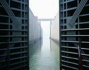
Grotjahn and Gorchov shy away from metaphor, but one has to think of a lock in the Three Gorges Dam as an enormous double door. On video, one can also watch as it opens, slowly and regally. Yet the true revelation comes as Catherine Yass brings the waters down to earth.
At first, everything about her installation promises transcendence and then some. Yass filmed the process in color before transferring it to high-definition video, to combine the warmth of one medium with the clarity of another. She projects the lock on tall facing walls, so that one cannot imagine oneself superior and apart. When shut, the lock really did make me think of cathedral doors—or perhaps the bronze doors to the Baptistery in Florence, where a competition to sculpt the gilded "Gates to Paradise" helped launch the Renaissance. When open, the lock reveals an expanse stretching into the distance, toward a vanishing point that Renaissance architects would have prized. They would also have appreciated that the lock's horizontal divisions amount to reinforced metal bars, the parallel walls behind them concrete, and the object in the foreground a commercial boat.
 One has plenty of time to make the adjustment to industrial materials, for it takes time to pass through a lock. It also takes time to recognize the canal's scale. The doors looks more than tall enough, even before a tiny figure crosses the ship's hull. I have no trouble believing that the dam encompasses a reservoir some 370 miles across. Completed in May and due to become fully operational in 2009, it promises enough electricity for Los Angeles four times over. Meanwhile, it lets in enough light to recall Western or Chinese landscape traditions.
I take my factoids on trust from Wikipedia, which also notes the disparity in wealth to which the dam will contribute, and the Chinese government ruthlessly suppressed protests against it. Even the project's nasty underside makes American capitalism look cheesy by comparison. However, just watching it unfold brings it down to size, much as the facts put its grandeur into perspective. To permit passage, the water level changes, and Yass allows her point of view slowly to rise as well. The two projections also disrupt any simple unfolding of time and space. As one view fills with light and water, the other bars the way.
A floating point of view recalls Chinese painting. The intrusion of human engineering into the wilderness recalls a common theme of the Hudson River School. However, here human activity supplies everything—the scale, the foreground activity, its reason for being, and the changing point of view. Yass does not exactly disrupt the act of contemplation. She merely permits it, with due attention to time, space, and who gets to shape it.
Does any of the lock Yass monster sound pretentious? In a larger front room, Yass enhances photographs with light boxes. A distant city dissolves in sunlight behind a broad view of the harbor and its heavy machinery. Perhaps one does not have to choose between modernity and transcendence. One can merely enjoy them both while putting them in their place.
Open and shut case
Judging by all this, not to mention Scully and Marden, not to mention Moira Dryer, I have spent the fall staring at half-open doors. Artists must be warning me not to leave the office. Two older artists, however, suggest an escape route. They could almost invite bursting through those barriers.
A two-gallery show for Ellsworth Kelly starts innocently enough. By one entrance, four canvases share a wall just above eye level. Each identically warped rectangle has a different strong color—in sequence from blue, red, and green to black. The odd shapes could simply have fallen there by chance, as light through a real window. However, the gallery's garage-door pane could not have done the job, and the methodical series attests to a painter's care. They leave one juggling an illusion, a fact, and a vocabulary lesson.
In an upstairs room, the works grow in size and regularity. In each, two ordinary rectangles align along the bottom and along either a left or right edge. The canvases sit one on top of the other, with the near one protruding horizontally, the one in back vertically—but to a different size and extent each time. One color could be pressing down on the other, squeezing it out. Taken as a whole, the ensemble looks active and irregular. I had to look again to confirm that I had seen only such simple shapes in red, yellow, green, and blue.
Whereas these all date from 2004, Kelly continues hard at work at age 83—and he is even about to curate drawings for the Morgan Library. His latest works takes the same motif of one canvas atop another, but color vanishes, and the planes fall where they may. Between the close hanging and the starkness of black and white, the varied shapes look flatter than ever but possess a greater drama. White moves as sharply across the gallery's walls as shadow. I have often resisted Kelley's plainness, the way his surfaces deny any trace of their making. However, I have returned to him again and again since Chelsea hit the ground running ten years ago.
Where Kelly opens the window, Fred Sandback breaks down the door. In a corridor his long, dark threads outline rectangles, with the same illusion of solid planes as at Dia:Beacon. One low wall appears to lean against another, the real one, as in John McCracken's casual California Minimalism. While closer in age to Brice Marden or Sean Scully, I always associate Sandback with the purity that the two painters had to work past, especially in early work. In the main space, however, I start to remember how Minimalism allows impurities like me into the work after all.
On the one hand, here Sandback more strictly follows the constraints of the gallery and refuses illusion. The simple threads run vertically, from floor to ceiling. Their colors and title, Broadway Boogie Woogie, pay tribute to Modernism's design director, Piet Mondrian. On the other hand, they create a flood of color, line, planes, and spaces. Sandback thickens a line into brighter color by stringing two or three threads together, often pairing two lines like a shaft of light. As one moves among the shafts, one could be sharing not a room but an ever-changing volume of light and color.

"Ron Gorchov: Double Trouble" ran at P.S. 1 through September 18, 2006, Catherine Yass at Galerie Lelong, through December 9, and Fred Sandback at David Zwirner through December 22. Mark Grotjahn ran at The Whitney Museum of American Art through January 7, 2007, and Ellsworth Kelly at Matthew Marks through through January 27. One can think of this as continuing the fall reviews of Sean Scully, Brice Marden, and others. Grotjahn's winter 2007 gallery exhibition ran through February 28 at Anton Kern.


