Like Wildfire
John Haberin New York City
Abstraction: Melissa Meyer and Angelina Gualdoni
Mike Childs, Wayne Herpich, and Anoka Faruqee
Remember "painting is dead"? Abstraction has done more than survive: it is hotter than ever. One could almost mistake an ice-cold February for the good or bad old days of expression and excess.
In a single month, Iva Gueorguieva in torn linen recalled the energy of Abstract Expressionism and the architecture of Cubism, while Emilio Perez applies an X-Acto knife to root his wet-on-wet painting in drawing. Joanne Greenbaum bursts the hierarchies of grids and colors, Sarah Cain treats her wiggly diagonals as the elements for a gallery-length mural.  Excess need not mean a loss of discipline either—just a healthy reminder now and then of the recent past. Melissa Meyer sustains lyrical abstraction by bringing out its sign language, and a tribute to Moira Dryer shows how her restraint influences madder compositions today. Angelina Gualdoni and Mike Childs both return to crosshatching, to explore the spectrum between interiors and abstraction. And both Wayne Herpich and Anoka Faruqee take excess so close to the edge of vision that one could almost call it Op Art.
Rewriting the lyrics
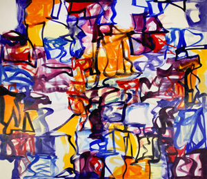
Melissa Meyer may never live down the term lyrical, but few have done more to earn it. Oil in her hands moves across canvas as easily as sunlight through a summer afternoon, and nature and the color wheel might compete to claim its colors for their own. Oil washes take on the fluid texture of watercolor and the freehand curves of ink on paper, like silk for Lauren Silva. She achieves much the same effects in watercolor, on sheets up to a meter in height, while her paintings over the years have approached calligraphy. They are also ambitious paintings, easily filling a canvas and a wall. Joan Mitchell might have achieved them had she absorbed the lessons of Chinese art and dance.
Lyrical abstraction is not often a compliment. It long identified Mitchell and Helen Frankenthaler, Howardena Pindell and Alma Thomas (to name two examples of African American abstraction), and, sure, a few men (like Sam Francis and Beauford Delaney) with girlie stuff. It stood for continuing Abstraction Expressionism after Minimalism had shown that abstraction should be made of sterner stuff—and indeed widely praised new paintings by Larry Poons left me cold. Meyer's last two solo shows received raves from publications as conservative as The New Criterion and The Wall Street Journal. John Yau, as sane as ever, felt compelled to insist that her joys have "entered into a real that is disjunctive to the point of jarring." It components had begun not just to dance but to jump.
I have taken Meyer for granted myself, but I think I may finally be getting it. One can see the jumps as a lack of disjunction, with each calligraphic trace and color in its cell running up against and slightly into others. Meyer can thus play fast and loose with the grid, while making its rigor her own. She can also draw on Chinese calligraphy to move between color and works on paper in black and white, as if taking stock of her own strengths—and as a reminder of how painting and drawing can still feed one another. Her evolution has meant simplification as well, in a marvelous paring away of expressionism's muss and fuss. She also cites as inspiration Art Brut and Jean Dubuffet in France, but simple does not have to be simpleminded.
Meyer has been exhibiting since the 1970s. Some twenty years ago, her broader color fields ran over one another, including greens close to Mitchell's. They were more obviously expressive, but also more static. Before that, her work included thicker textures and hints of still life. Maybe the excitement of the simple is most evident now in the largest and freest work, in the back room, with the choice between primaries on one wall and blacks against purples over white and yellow on another. Lyrics can be pretty disjunctive anyway, and she can cite in Bob Dylan to prove it.
Another tribute to women in abstraction and their "Labyrinth of Forms" comes with a two-site display in honor of Moira Dryer. One room has work from shortly before Dryer's death in 1982. It includes large monochromes in acrylic on wood with a thin but heavily worked texture, somewhere between washes and burning. It also includes work in acrylic and casein that exposes the support as if seen from behind—or exposes the materials for what they are, with warping and brocade as if stitched together. These apparent opposites have in common a formalist's twin demands for pure painting and for art as object. They also soften those demands through muter tones and more palpable objects, refusing either obvious expression or the grid.
Around the corner, the gallery's second space picks up on those variations on a theme with younger artists, again on behalf of women in abstract painting, like "Perseverance" in Chelsea. Mika Tajima, for example, has the weathered monochrome on fabric and wood, Jeffrey Tranchell the bare stretcher. Mary Weatherford lets stained canvas hang loose beneath neon, and Julia Dault frees it from the wall with her own recourse to artificial leather. The choices seem arbitrary—or just self-consciously Lower East Side currents. Noam Rappaport's angled one-color rectangles, each with its own stretcher, owe way more to Ellsworth Kelly or Ted Stamm, and Jackie Saccoccio just plain paints exuberantly and well. Maybe all that matters is that at last no one is apologizing.
Hatching a scheme
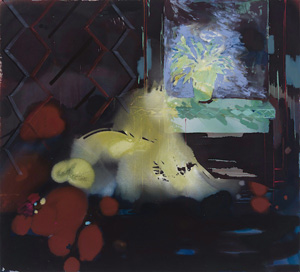
Interiors by Angelina Gualdoni grow more real the longer one looks. First, though, one has to let go. One may hate to give up seeing them as abstractions, in which oil and acrylic can take on rough glow of enamel. (No, she is hardly Jackson Pollock, but then who is?) Gualdoni appeared in "Pour" last spring, and her stains spread outward from the center of a canvas. And then a brushstroke or a spatter may land on top of that.
One may want to hold onto the bare spots, the incomplete edges, the awkward vagueness, and the loose compositions suggestive of an unfinished painting, much as with Clare Grill or Patricia Treib. Gualdoni also appeared in "The Trace of a Trace of a Trace" in 2006, and who after Postmodernism does not expect reality to remain at a third remove? Speaking just for myself, though, I most wanted to see her paintings as crosshatching after Jasper Johns. The motif may serve as wallpaper, tiling, a tabletop, the base of a window, or nothing obvious at all. As with Johns, it often appears in thin bright lines on white, but it can also deepen into darker traces against deep violet, almost like Johns in encaustic. It never once fills a canvas, and it does not coincide with the picture plane, but it can still drive the rest of a painting into depth.
 That drive, of course, is realism, as is the identification of color with light. Gualdoni's series depicts a plant on a table or ledge, either outdoors or in front of a window. In the interiors, the window is the only source of light. Her morning and afternoon sunlight can wash out the background entirely, leaving a tangled silhouette. It can also sink much of the room in shadow, which then gathers more color. Painting cannot get more realistic than that—or more abstract.
Mike Childs, too, works with crosshatching. He treats it not as a subject in itself, as in all-over painting, but as what his show calls "Structural Tendencies." The tendencies include broad areas of bright but flat color, with hard edges but unfamiliar geometry. They also include irregular diamond patterns in gray or more muted colors. Rather than Johns, they may recall Terry Winters, but without the fuss or the science fiction. Think of Winters for a crisper, simpler today.
Like Winters, he is not above illusion. Where Gualdoni is among the many these days working between realism and abstraction, Childs sticks to abstraction, but with its own broken borders. Rather than a flat surface set against a deeper space, his grid is a window onto depth. Or make that a window onto windows. His cells may curve, like fragments of a buckyball, or bounce around in the picture plane. They may also have thick edges, like old TV sets, with additional shades of color or gray within.
The contrasts keep one looking, only partly to decipher the imagined architecture. Maybe Peter Halley will come shopping for storm windows for his postmodern prisons. Others, though, will relish the shifting colors and scales in two dimensions, like an orange field rolling in from the left. The shifts may well depend on scale. Works on paper in black and white look great online, on the same full screen as a canvas, but do not hold up as well in the gallery. The paintings, in contrast, keep on tending toward structure.
Storm ops
Anyone claiming to revive Op Art should make one at least a little queasy. Even at the time, it seemed something of a passing fad, although it had its roots in the teachings of Josef Albers and hopes to elevate painting to a science. Fifty years after the Beatles landed in America, it can seem a quaint reminder of the psychedelic era, all the more so now that optical illusions are a dime a dozen on the Web. If it survives at all, like the art of Bridget Riley and Julian Stanczak, it had better make one uncomfortable. It should make one question the rigor of abstraction and excess. It should have one reaching beyond the textbooks—for the railings or for one's stomach.
Wayne Herpich keeps painting because, he says, "It keeps me uncomfortable." Nearing seventy, he speaks of wanting to disrupt the oppositions in art between east and west, Florentine and Venetian, abstraction and figuration. Others are more likely to find his show exhilarating. They are also less likely to see art historical references than lively abstraction. While not really Op Art, his paintings cater to what a 1965 show of the genre at MoMA called "The Responsive Eye."
Like Rob de Oude, Herpich fills a canvas with patches of brightness, each constructed from not quite parallel zigzags of oil colors. Thick or thin, the strokes nestle into one another, reinforce one another, and disrupt one another. Even the glimpses of off-white ground in the largely all-over compositions seem part of the game. Some paintings may recall Native American tapestries, only smaller, brighter, and torn apart. Titles like The Candy Store and The Haas Halo suggest the twin concerns with optical activity and visual pleasure. Could Haas refer to the Austrian inventor of Pez?
Anoka Faruqee makes one uncomfortable in a more obvious way. Her abstractions are hardly eye candy, and they are best seen on an empty stomach. She calls the show "Future Perfect," perhaps to find a double meaning in the word tense. Her art of perception runs to upsetting color combinations like shades of purple or lemon yellow against a seasick blue. Then she arranges them in tight but never quite symmetric circles and waves. The Moiré patterns take off from there.
She in fact calls the earliest works "Moiré Paintings," an acknowledgment of both fabric design and vision. Paint on linen laps over the edge of a supporting panel, further insisting on both the fabric and the disruption. Her technique itself recalls the repetitive habits of Op Art, although with thicker and more high-tech means. Faruqee builds up the mix of acrylic and gel, and then she sands it away. Titles like 2013P-83 convey a card catalog's concern for order and a specialist's disregard for intelligibility. They also sound like robot villains in a dystopian fantasy.
In practice, everything seems in order, but also a mess. Larger paint splotches fall across the densely woven dots and curves. Paired arrows of light radiate out from the center of a circle, only to shift position as one shifts one's stance or one's eyes. The gallery cites the influence of John Cage as well as Albers (and like Albers before her she teaches at Yale), but the dizziness lies far from Cage's meditative and casual silence. As with Op Art from the start, one may never be sure that one has seen more than an obsessive trick. Just hold onto your seat.

Iva Gueorguieva ran at Ameringer | McEnery | Yohe through March 8, 2014, Emilio Perez at Galerie Lelongthrough February 1, Sarah Cain at that gallery through March 15, Joanne Greenbaum at Rachel Uffner through April 20, Melissa Meyer at Lennon, Weinberg through February 15, Larry Poons at Danese/Corey through February 8, Moira Dryer at Eleven Rivington through February 22, Angelina Gualdoni at Asya Geisberg through February 15, Mike Childs at Robert Henry Contemporary through February 2, Wayne Herpich at Blackston through February 20, 2014, and Anoka Faruqee at Koenig & Clinton through February 22.


