Oh, What a Tangled Web
John Haberin New York City
Terry Winters and Friends
Ethan Greenbaum and Diana Al-Hadid
If you are like me, you might hesitate to encounter Terry Winters at the Drawing Center. If nothing else, he may seem too established an artist for, after all these years, still an ever-changing arts space—now with a new director, Laura Hoptman.
You might head downstairs first, to put off his familiar spore imagery until after allergy season—or just to use the facilities. Then, too, the stairwell may be just too hard to resist. Inka Essenhigh covers its walls from floor to ceiling with an alternative architecture and alternative New York City. Still, Winters has a way of catching up with you. 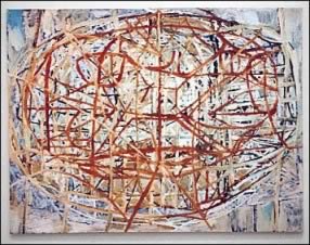 His imagery is not so easy to avoid, not even in work on both floors by other artists. Taken together, they invite one to untangle their devious relations.
They are not alone in seeing a human hand behind the seeming traces of nature, for Ethan Greenbaum does much the same in plastic. It becomes a physical imprint, thanks to tools more often associated with photography and high tech. So, too, does Diana Al-Hadid in a tangle of sculpture and impasto. When she calls a painting The Square, you may have trouble seeing a painting or a square. It might look closer, in fact, to the remains of either one. It becomes what the Bronx Museum calls "Delirious Matter."
Knotty problems
Unlike its storied ancestor across the Pond, Essenhigh's Manhattanhenge is neither static nor lacking for shelter. A first glimpse past the lobby desk suggests a tall figure swaying to her own beat. Its loose red skirt turns quickly into the proverbial red carpet for a fictive winding corridor to nowhere, and its loose arms extend the actual railing. The stairs down seem to open onto a wide street, between high rises to either side with their own rhythms. They also break for one last deception, an apparent stage curtain to the side where one must instead go straight ahead. From there, Susan York will have you moving right along, all the way to the back.
Foundation tunnels through time and space. Its title alone suggests an arts institution, its basement, and its history. And it appears on the walls as objects, shading, and the materials for both. York has made graphite replicas and pencil drawings of granite piers uncovered during the Drawing Center's 2012 move to Soho. Their staggered horizontals open onto a back room with its own attraction as well. Those who visited not long before could hardly turn away from the red glow of heat lamps in the basement "laboratory."
Could they be nurturing the originals for Winters and his spores? They do illuminate a few spare twigs that appear to grow out of small cartons. Mostly, though, they serve Eduardo Navarro to cook up his next meal. He ended his run by turning those and other "edible drawings" into soup, as Into Ourselves. He intends to confirm a principle from quantum gravity, that information may be scrambled but never destroyed, not even in a black hole—and he asked visitors to sign up to join in the tasting. No, thanks, on both scores, but you can see why the work's run was short lived.
Back upstairs, the Center's "drawing room" looks emptier still. Turn around, though, for a surprise. In the guise of Hipkiss, Alpha and Chris Mason interrupt a solid red wall with vertical drawings of plant life. Bulwark could be right out of Rococo wall panels, give or take the silvered paper and tape. As both science and art, it has a precision far from Winters, but with much the same collision of organic life with decorative art and formal structures. You might finally be ready for the main act.
"Fact and Fiction" follows Winters across more than thirty years in just thirty sheets, most of them large, and eight display cases for smaller works. You have every reason to see them as familiar, going back to this Web site's very first Chelsea art walk or even before. You may see them, too, as inaccessible or obscure, like the tangled weave of his Tessellation paintings—or like hard and soft science. His Knotted Graphics allude directly to the confluence of mathematics and art. They are also, well, knotty.
The curator, Claire Gilman, speaks of the "biological, technological, and mental" aspects of his work. Unlike a strict student of biology and art, Winters finds images in print and online, in order to reimagine them as abstraction. His imaginings have also changed from the charcoal smudges surrounding those very first spores. A second wall, for the 1990s, introduces brighter colors, freer curves, and sheer splashes in ink, gouache, and acrylic. In the next decade horizontal lines cross in front, so that the weave becomes not just shading but subject. They might prepare you for another encounter with the museum's rails.
Just one word: plastics
It has been a long time now since Paul Delaroche, impressed by a newer medium, declared that painting is dead. Where painting, in old metaphors, was a window or mirror onto nature, a photo to Delaroche in 1839 was nature's direct impression—and now anyone with a cell phone can create it and share it. Ethan Greenbaum does that one better. He does not just take an impression on paper, but rather burns it into plastics. He is anything, though, but direct. He dares one to decipher its signs.
Not even Delaroche could believe in magic after reading what Greenbaum has made—direct to substrate, double-sided prints in vacuumed-formed PETG and acrylic. It would be hard, too, after getting close to his images, which he reworks in Photoshop before printing them, adding paint, and then using heat to sear image and ground together. They sure look burnt or worse. If others let nature leave its impression, he has let the city deposit its residue. Layered plastic retains the shapes and imprints of street signs and barriers. Pitted plastic becomes the reserve for something that you might just as soon rather not know.
They convey a sense of danger, much like a Caution sign or dock ladder for Robert Rauschenberg in the late 1950s. As in those combine paintings, someone may have already driven way too far. They convey a sense of the visceral, much like painting, and Greenbaum began as a painter. For all his process and materials, his objects never look mass produced or badly in need of recycling. 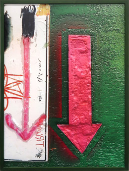 A human presence appears often—and not just in his rough surfaces. Images include what might be handwriting, graffiti, and a tall shadow on sunlit ground.
They also convey a sense of humor and, maybe after all, a window onto the world. Anyone might have walked these streets, amid the color and texture of their sidewalks. Henry Rothman kept returning to just that in more traditional photos. Anyone, too, can recognize these red and yellow arrows as a warning or a reminder of "this end up." Just bear in mind that they point down. Anyone might puzzle at some half-effaced rectangles with horizontals and diagonals, again in red.
Greenbaum calls attention to the puzzles with the show's title, "First Surface." It suggests something primal or original, like gut instincts or the avant-garde. It also suggests surfaces not so easy to penetrate. Here street signs have lost their ability to direct traffic but not their ability to direct the eye. Acrylic serves as both paint and ground, and you may know PETG as the filament in 3D printing. The artist might aim at mass reproduction after all.
He has been leaving tall acrylics since at least "Decenter" at the Abrons Art Center in 2013, where they looked like oversized laboratory slides, and at the 2017 Armory Show. Now he is taking his art to the streets while recreating them in the gallery. It may lose something in memory, where it can settle into abstraction or disgust. Is he just rubbing one's nose in the gutter? Sure, but it is only as disturbing as the city. Rub your nose in it.
Homage to the square
Up in the Bronx, thick but ever so slim white lines and curves run every which way, in a precarious impasto. They may fall into abstraction, or they may represent the very heart of a great European city—not a plaza but a cathedral. But then a cathedral interior once took on the function of a village square and then some. For her contribution to 2018 New York summer sculpture, Diana Al-Hadid turned a fountain into her Citadel and remade Madison Square Park as a garden. One can see her thinking aloud about what it takes to create a public or private space. The white itself holds multiple meeting points.
Is it even a painting, much less a square? Taller than it is high, gaudy, and maybe a bit pretentious, The Square could pass for white on white and white again, like Robert Ryman on steroids. One could mistake its yellow and green highlights for reflected light. Al-Hadid constructs her work not from oil, though, but from gypsum, plaster, and tape before adding pigment and, often, gold or copper leaf. She also uses Mylar and fiberglass to set the picture an inch or two off the wall, like a light box without the light source. The work has enough light of its own.
And then she cuts right through the surface, and what may look like shadows are more often than not the cuts. They create additional lines and curves, reinforcing the cathedral space. They also incorporate into the painting the dark space of the box. Further titles like Late Last Night, Mob Morbidity, and In Mortal Repose make a point of the darkness. 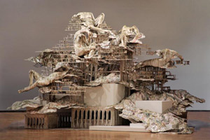 So does sculpture, including feet cut off from a body and a gilded hand in a cloak. The interplay of painting and sculpture, addition and subtraction, interior and exterior, or light and darkness further explores the limits of a public or private space.
So do Al-Hadid's points of reference, which approach a private language. Born in Aleppo, Syria, and still in her thirties, she fits with the museum's commitment to the community and its diversity. She shares it with a Cuban artist, Manuel Mendive, and photographs of Iranian women. She also models one painting on sixteenth-century panoramas in Ottoman art, although I could not make them out. Again she is remembering a public language while making it hard to hear. She throws in a short history of Western art as well, with paintings based on Hans Memling in the Northern Renaissance and Giovanni di Paolo in Siena. Giovanni supplied the cathedral.
She may admire him for the charm of his slender figures and their button eyes, caught between the Renaissance imagination and folk art. Like him, she is nostalgic for past points of reference while creating new ones. Naturally hers include a woman's body—implicit in the palpable surfaces and their cuts, explicit in her imagery. Her women in white in Madison Square might be reclining, reduced to rags, or falling to earth, and the Bronx Museum includes a photograph to connect them to the paintings. A sculpture in bronze seems to land on a black disk with a splat. It might represent the artist's process, her closeness to abstraction, or the head of a Medusa.
Where curators see bodies in motion, I keep seeing falling water and cascading white, like a drip painting. The show's largest work by far takes on a fountain in Rome by Gian Lorenzo Bernini. It adopts his twisted nudes, along with enough abstract mass and quotes from an old map to stop just short of chaos. It is again a very private artist's public space, and elsewhere she invites one in. One can step behind a wall, where the cuts dapple the space with light. Like abstraction for Josef Albers, it could be her ultimate "homage to the square."

Terry Winters and Hipkiss ran at the Drawing Center through August 12, 2018, and Eduardo Navarro through April 22, while Inka Essenhigh ran through August 4, 2019, and Susan York through February 4. Ethan Greenbaum ran at Lyles & King through June 2, 2018, and Diana Al-Hadid at the Bronx Museum through October 14, 2019.
