Conceptual Rococo
John Haberin New York City
Rudolf Stingel
How did art get so big? Appropriation has grown from a bicycle wheel or Pop Art's cool appraisal to shark tanks and topiary puppy dogs. Painting, sculpture, and installation have expanded, until a lavish Chelsea gallery resembles a Manhattan closet. In the case of Rudolf Stingel, it would have to have its own wallpaper.
Conceptual art, too, has come a long way. Let others supply bare-text instructions for a work, forever awaiting its execution. With Stingel, even a near-empty room, decorated on the cheap, can have the look of Versailles on moving day. The concept alone has outgrown the art object. Much of the time, one knows what went into Stingel's work only if one has read reviews.  Critics have their uses.
At the Whitney, barely twenty works from as many years fill the entire fourth floor. Call it conceptual Rococo. At once textual and untitled, tawdry and luxuriant, minimal and garish, recycled and site specific, skeptical and sentimental about the museum, democratic and utterly self-involved, the retrospective will leave the same person impatient, bored, delighted, and part of the show. The critical cliché that accords him two sides, as installation artist and realist painter, hardly does him justice.
Does that lack of resolution sound a little like desiring? Stingel's work is all about desires, and pinning them down is half the fun.
Second thoughts
With Stingel, part of the fun, too, comes in second-guessing oneself. I do not mean just moments later, as in the deepening experience of a Vermeer or the growing sensual awareness of a Richard Serra. It can take leaving the building. In my own case, it has taken years.
Stingel, from northern Italy, calls America home. Maybe his status as an American artist further adds to the mind games. It also attests to the Whitney's continued attempts to redefine American art for an age of Armory Shows, art fairs, and globalization.
Once here, he made a splash as early as 1991, with plush orange carpet on the wall. Critics took note of its play with painting, Minimalism, and found materials. They noted how a visitor's hands could, for a moment, shape its surface. They noted how the artist himself had transformed the room with saturated color. Perhaps they chose not to remember his black rubber Hindu goddess of 1994, bearing small appliances and, thankfully, not at the Whitney. However, my own first encounter—at least the first that has stuck in my mind—came in 2004, when his carpeting had settled firmly to the floor.
That summer, Stingel laid pink and blue floral carpeting on Grand Central Station's south hall. Like Carl Andre or Serra's Delineator, it invited one to walk across. Like Christo, it wrapped New York's grandest architecture in mass-produced fabric. Like Andy Warhol and Warhol's wallpaper, it scaled up the kitsch. Like any number of trashy installations, it packed the joint, but for once without pushing the viewer out.
It brought patterns from nature to industrial materials, industrial patterns to art, art to the masses, and the masses to and from work. I admired its audacity but felt cheated. More than Andy Warhol, it promised an openness to the viewer and a touch of shock art, but few changed their movements or even took note of it, and it shocked no one. It promised site-specific art, and yet Stingel had installed the same carpet elsewhere before. He would never, as Diana Cooper does, redouble the skylight.
Now I have second thoughts. It takes an unusual turn of mind to design site-specific art without taking the site into account. Could an artist so indifferent be working out alternatives to the art frenzy? The other contradictions have something going for them, too. I still do not think much of the outcome. Yet could he have meant people not to notice? At his retrospective, more than a few works develop elements of that piece—and in ways harder to ignore.
Desire lines
Although Stingel has turned fifty, much of the show dates from this decade. Bad taste and ready-made patterns again appear, this time derived from wallpaper. He again calls it painting, and it hangs on the wall like an actual panel or canvas—which in turn only intensifies the strangeness of wallpaper in a museum. One room contains three ornate patterns in gold on gold. Next door they darken to black on black, and their sheen carries across the room. The hot orange of a sculpture stuck in a corner nearby, a cast radiator, surely has more to do with its chilly surroundings than the heat within.
The three gold patterns look like paintings, but they form a single work along with a mirrored floor. It succeeds far better than his installation at Grand Central Station, from its absorbing ugliness to its emptiness, which come together in a reconstruction of space. It makes the viewer again a part of the work, but now consciously so. One can grow dizzy looking down in this hall of mirrors. I felt dizzy trying to walk while not looking down. I felt grateful for the firm footing of the next room, for all its encroaching darkness.
The retrospective has only one carpet, this one covering a wall. The title identifies it as white, but it shows the black marks of months of wear from the artist's studio. Like everything by Stingel, it sounds like an easy joke but looks comforting. Its history roots even its slap at art in ordinary life. The artist did not work all that hard at defacing the museum. He just went about his business.
Footprints appear more overtly in thick Styrofoam. The artist stepped in solvent before walking across to his heart's content. Human traffic again pursues its own course. Landscape architects call worn paths off official trails desire lines, and Stingel's ironic gestures always admit desiring.
Glitter has come to signify desire at its least common denominator. Gay pride in turn has seized it to signify desires that others deny. Stingel, too, surely draws on his fantasies as much as his irony. Roberta Smith of The New York Times compares the white Styrofoam to the Italian alps, nor far from the artist's childhood world. A catalog essay roots the wallpaper design in Bavaria.
His desires did not subside with adulthood. They may in fact have peaked with the retrospective's earliest work, right around when Stingel encountered the awfulness of America. Three panels from the late 1980s—in red, yellow, and blue—look as bright, as silvery, and as purely bad as any I have seen. Like the Styrofoam prints, the dents and accidents call attention to his involvement, but not exactly his self-expression. His marks cut most deeply in two other Styrofoam paintings from around 2000, each gouged out with a woodworking tool. In each, he turns to pink, perhaps the color of excess.
Instructions for a self-portrait
As at Grand Central Station, one cannot truly call the desires the viewer's rather than the artist's. He will always care a great deal more than others about himself and his work. He may critique the theory of art as expression, the idea that art says something about the artist or other than itself. However, he does so by asserting himself. At the same time, Stingel's attention to himself extends only so far. And this, too, owes something at once to Modernism, to prefabricated materials, and to sheer bad taste.
The three early panels have little to distinguish them or to endear them. He tackles Abstract Expressionism like Gerhard Richter and Richter's late work, but as if too clumsy even to wield a squeegee properly. Obviously he runs mechanically through the three primaries, and less obviously Stingel applied the enamel and oil through common mesh fabric. Not just the image, but the very silkscreen is in public domain, and he published instructions for making one's own genuine Stingel. The pink Styrofoam similarly adapts the grid and concentric circles of geometric abstraction, and its color and material derive from household insulation.
Stingel's image emerges at the shows end, more or less. Naturally enough, by then he seems almost to have given up on his desires, and he refuses to state them anyway. In the last room, three large self-portraits face the black patterns. Earlier, next to the white carpet, he had a self-portrait in military uniform and a big, rather silly beard. There, he looks like a wide-eyed imitation of Fidel Castro more than an eager recruit. By the end, he lies rumpled and fully clothed—whether tired, lonely, depressed, or just pleased to afford a decent hotel and a shot at the Whitney.
He surely must want something or someone. Characteristically, however, he does not give the game away. He does not even call them self-portraits. He names them instead after the person whose photograph he has copied in paint. They show him an accomplished realist, versed in the great tradition of looking and desiring. Then again, as Chuck Close, Melanie Vote, or Rackstraw Downes has shown, photorealism also shows the process of copying nature at its most impersonal.
Stingel may seem to have progressed a long way, from blunt, over-the-top abstraction to chastened self-portraits in black and white. His dance between conceptual art and appearances has grown messier. Yet again I had second thoughts, and not all second thoughts are for the good. Before, I had wondered at first if he had enough going on. Now I had seen someone able to take sentiment down a peg, but has he created his most sentimental work of all? Realism often caters a public's worst desires, and prefabricated can have disturbing meanings when it comes to art—or prefabricated housing.
I felt those same second thoughts in my own second big encounter with his work, in 2005. Had the same artist carpeted—or perhaps one should say carpet bombed—a train station and called it painting? Now he really was painting, only he effaced painting's traces so beautifully that one could not miss seeing the room. It became a cathedral devoted to his dealer, her image, and her vision for art, and it challenged one to sort those out. Three years later, I am still sorting it out.
A shrine to Paula Cooper
Paula Cooper introduced galleries to Soho, and for years she introduced me and others to art as well. Her Chelsea gallery says a great deal about how the status of contemporary art has changed over the years. In Soho, I could interact with a floor piece by Andre, because the art she loved felt so completely at home. Now artists must struggle not to disappear into her cathedral-like space. Remarkably, Stingel choose instead to vanish, but he transformed the space all the same. 
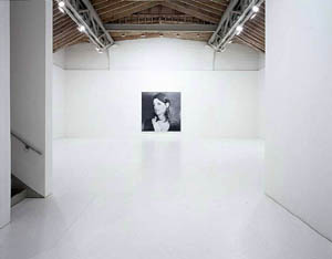
As the winter of 2005 drew to an end, Stingel refloored the entire gallery, from desk area through the two rooms, in particle board painted flat white. Already one can sense sly references to everything from Cooper's favored Minimalism and Robert Ryman's persistence to the gallery itself, as well as to Soho's origins on the cheap. A hot Lower East Side gallery till recently made do with similar flooring, only without the paint job. This exhibition ran just as Artforum added a Web site devoted to art-world gossip.
The installation had just one other element, a painting of Cooper herself in 1984, adapted from a photograph by Robert Mapplethorpe. In those days, art was glamorous and not simply expensive. She was, too, and looked the part, and that only begins the work's associations with a generation. Back then, Mapplethorpe and art alike posed a risk, and images in painting—with thanks to Paula Cooper—were becoming halfway respectable. Realism like Stingel's was clearly a no-no. It helps that, once again, his touch practically vanishes. It helps, too, that he left enough brushwork showing to send up both photorealism and his own achievement.
There remains the matter of that white, which acquired more and more scuff marks over the course of the exhibition. The visible path toward the painting elevated the shrine to Cooper even more, the way pilgrims leave their traces. It also quite literally blackened the shrine, a reminder that galleries exist to attract visitors, perhaps even a paying customer or two. In the process, it restored the hierarchy of values behind one's admiration. It recalls how the Minimalist esthetic welcomes an interaction with the viewer.
It also left one chastened by one's own worshipfulness. Perhaps it left Cooper a little chastened, too. Perhaps she felt pride and wistfulness about the exhibition, about her role in contemporary art, and about herself. Stingel foregrounds the aura of art and its dealer without quite wanting to dispel it. Perhaps once worship is gone, I thought, admiration really can begin again.
Again, however, I came to have second thoughts. Two years later, he exhibited more big portraits at Gagosian. Again Stingel was copying Mapplethorpe, and again he was playing to my desires and to a major dealer, but without the dirty floors. He choose Patti Smith, from around the time of her first album. I had a big crush on her, too. And at the 2006 Whitney Biennial, his weary self-portrait seemed to speak of alienation without rebellion. Had he sold out, or had his glibness meant less than I thought all along?
Hit-and-run art
Thanks to the retrospective, I do not have answer, but I can stop worrying about it. I can see echoes of the Paula Cooper installation, like the scuff marks on white carpet, just as I could of Grand Central Station. And I can mine them for pleasure more than for a definition of art. Realism and wistfulness slip in and out. I can, however, see other things, too.
He may not exactly make abstract art, but Jackson Pollock and Bed by Robert Rauschenberg, too, remade mural painting as an extension of the floor. He may not exactly make conceptual art, but try to figure out the process behind his abstractions or the subject of his portraits without a press kit. He may not exactly make something other than conceptual art, but one can still slip on his mirror. He may not reflect even his own desires, but one can look at oneself and others in the mirror, and one can puzzle out what the apparent references to traditionally feminine materials or gay culture mean for an Italian-American male. He may not explain what he represents, but he paints it skillfully. He may not require deep thought, but try asking whether following his instruction book would make a painting by Stingel or an original.
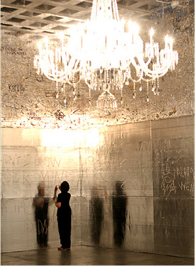
The conflicting desires come together right off the elevator. The entire first gallery looks silvery, but the foil belongs to store-bought insulation. It transforms even the Marcel Breuer ceiling grid. Stingel invites visitors to write or to draw what they wish, and the need to dent the insulation rather than trace in foil comes as a surprise even if one should know better. It imitates graffiti art, but with its own glow and without the pandering of a similar invitation to participate in the Brooklyn Museum's graffiti show. It lacks an instruction manual, but it does have some pretty tough competition, for a kind of frieze overhead preserves the end product from the show's first stop in Chicago.
The tasteless glare and familiar materials locate the work in the present. However, they also distance it from the modernist architecture. Besides, a preposterously ornate crystal chandelier hangs from the ceiling. In short, it is the artist's most site-specific work yet, but it, too, replicates a previous installation once removed. It adapts a work from 2002, and it moves more or less intact from Chicago. Stingel could always buy more insulation anyway.
Site-specific art has adapted to the rootlessness of a global world. It opens a small retrospective, as easy to walk through as it is to enjoy. Roberta Smith compares it to an Americanized Arte Povera, not unlike Alighiero Boetti himself, which makes sense. It points to both Italian artists that I tend to dismiss and to a consumer culture that I love to hate. However, Stingel navigates its poles with ease, along with contemporary art, Rococo, clarity, sentiment, and whatever else strikes his fancy. Every so often one can forget the whole thing, and every so often one can play along.
The silvery insulation prompts another desire—the motivation to return, to see how the process and image play out. In fact, while the portrait of Paula Cooper had me lingering and staring, this show may well go down best in hit-and-run visits. That fact alone could sum up Stingel's career. It is hard even to love the show without heading fairly quickly out the door. It is hard, too, to rush through it without talking about it for days.

Rudolf Stingel's retrospective ran at The Whitney Museum of American Art through October 14, 2007. His show ran at Paula Cooper through March 12, 2005. I have found it helpful to revise and incorporate a 2005 review of a previous show of Stingel's in Chelsea, to flesh things out. I refer to a 2004 work and the 2006 Whitney Biennial, but I leave the fuller description to their proper places.


