Sculpture's Ghosts and Monsters
John Haberin New York City
David Smith in White and Carol Bove
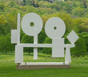
I could have traveled up the Hudson Valley to see the David Smith I knew. I could have found him at Storm King at his closest to Surrealism, with Iron Woman. I could have found him there at his most minimal, with Five Units Equal—or, with works like Tanktotem, everything in between. Instead, I found him at his most elusive, in white.
Carol Bove combines clear echoes of Smith with just enough frankness and detachment to make anyone squirm. In taking her sculpture to the façade of the Met, Bove had some unexpected company. A banner invites visitors to enter the dark imaginings of Francisco de Goya. Apartment dwellers across the street had worried that sunlight off burnished steel would be blinding. They should have worried instead about the light she shines on his darkness. And who knows what manner of abstract sculpture might emerge from the darkness, with "Chimes at Midnight" in her gallery? 
Why white?
A visitor to Bolton Landing may have felt that he had seen a ghost. David Smith had died two years before, in 1965, but his presence lingered over his studio, a converted farm in upstate New York—and over modern art. It lingered enough that the visitor, Ralph E. Ogden, bought thirteen sculptures on the spot, as the foundation of Storm King Art Center. When I first visited years later, their presence at sunset across the meadows, hills, and native plants helped me understand sculpture as drawing, as mass, as abstraction, as human form, and as site. Smith did, after all, title a work now in the Whitney, from 1951, Hudson River Landscape. I could not have known that, at his death, he left something more ghostly still—sculptures in white.
Storm King recreates their siting on its central "museum hill." Then it builds a larger exhibition around a simple question: why ever are they white? Smith studied painting with Hans Hofmann at the Art Students League, like Lee Krasner, Michael West, and many a future Abstract Expressionist, but one rarely thinks of him as a colorist. One thinks of his art more as steel, bronze, and more steel—stainless, burnished, rusted, or painted black. He took a summer job at an auto factory and kept on welding.
That last option holds out a clue to why sculpture had seen its ghost. The show mentions that he used white as underpainting. Case closed, right? Probably, but white keeps turning up in other ways as well, on two floors of Storm King's visitor center. He applied it to metal in at least one finished work, along with what he called moon blue. He used white coral along with terra cotta, wood, and wire in some early sculpture as well.
White appears more often in other media. It appears as snowy landscapes in photographs—and as sky or reflected light in photos of sculpture titled Black White Backward. It appears as the ground for drips like those of Jackson Pollock, but with the black squeezed from a syringe. It appears, too, in works on paper akin to photograms, as Smith sprayed black enamel over components of sculpture and removed them. Taken together, the uses of white span his career. They help round out a 2006 retrospective, on his centennial, and a 2011 show of his late Cubi and spray paintings.
Storm King draws on just the eight loans and its collection, including unpainted steel. It points out Smith's debt to iron sculpture by Julio González—and so to Pablo Picasso. Unlike past shows of Tomás Saraceno and Josephine Halvorson, it leaves the rest of its grounds to others, with the side benefit of extending Smith's presence. They include his wife, Dorothy Dehner, as well as George Rickey, Alexander Liberman, Alexander Calder, Mark di Suvero, and Joel Shapiro. The white sculpture comes across as bright, firm, and less ghostly after all. It could almost make Smith a colorist after all.
Heather Hart has a commission in the opposite direction, lost in the woods. Hart sets down an attic and roof, as if blown there like home in The Wizard of Oz. Hart has gone in the past for a woman's presence, through crocheting, and the presences of others, through found poetry and recipes. Here she treats the building to performances and recorded testimonials, as The Oracle of Lacuna. One can enter to hear about neighboring towns—or forget the heavy talk and clamber over the roof. The red wood and tar can serve as a playground or an echo of sculpture's red and black steel.
Monstrous company
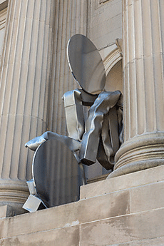
At the 2008 Whitney Biennial, Carol Bove made a point of her "time-specific materials." She could not have known that a pandemic would delay her Met installation for months and rid the grand stairs of its crowds. For a while, though, she had something better, a monster. She arrived at last soon after Goya prints, and the banner bears his Seated Giant towering over Fifth Avenue. Francisco de Goya also depicted the artist as dreamer in The Sleep of Reason Produces Monsters,  and Bove contributes something just as powerful, pathetic, and monstrous. Goya will be gone by the time her work comes down, but the monsters are already restless.
Like him, Bove accepts her limits in her title, The Séances Aren't Helping. Cuteness aside, it leaves open just how much her four figures belong to this or another world. (Both artists might enjoy the irony that banners last year, by Yoko Ono, invited the world to "dream together." Be careful what you ask for.) She identifies them with what Walter Benjamin, the Marxist philosopher and critic, called the angel of history, but each has at least one link to the mundane present. She assembles them from pipes with a square cross-section, like heating or ventilation ducts, only collapsing or halfway crushed.
Each also has discs at top and bottom, of the same burnished steel. (You might not see yourself reflected in them, but you can always dream.) The upper disc on one figure matches almost exactly the curve of the head, back, and shoulder of the naked giant just inches away. Taken together, the four might well be a single giant's twists and turns. You can produce much the same effect from your own shifting perspective just by walking past. Their brightness as they catch the sun collides with the darker reality of found materials, studio construction, and a bad dream.
Any artist who accepts a commission has to deal with its time and place. This architecture goes back a long way, along with the city's wealthiest neighborhood. The hapless, selfish couple in F. Scott Fitzgerald's The Beautiful and the Damned direct their cab uptown to ride past it. Who knew that the Met's architect, Richard Morris Hunt, intended to fill the tall sculptural niches all along? I found out only from the buzz surrounding the first in the series, by Wangechi Mutu. Bove, who appeared in a show of the "Unmonumental" and placed a giant corkscrew on the High Line, is only the second to fulfill his dream.
Mutu embraced the site while updating it. Her four statues fit ever so neatly into their neoclassical setting. In modeling her work on African sculpture, a strength of the Met's collection, she asserted a dual heritage and demands for cultural diversity today. Bove challenges the site instead. Her figures do not fit well at all, as if they were about to escape their niche and to land on you. An apartment building with ducts like that would fail inspection for sure.
They will look different over the months to come as one gets to know them and the banners change. Already a second banner, for the Met's British wing, shows ceramic teapots with, by contrast, an almost comic refinement. Bove has her roots in abstraction and a kind of hyperactive Minimalism. A disc is just a disc, and yet it shines. All four might be puzzling on first acquaintance, without the old trappings of public sculpture, but video of a crane lifting one into place is fantastic. Monsters now can rely on heavy machinery for their unfolding dreams.
Cousin silence
"Ha, cousin Silence, that thou hadst seen that that this knight and I have seen! We have heard the chimes at midnight." You can see all sorts of things in Bove's sculpture and hear all sorts of voices. The wonder is that it is still resolutely abstract. Her gallery uptown and in Chelsea have two distinct bodies of work, with two sets of voices. They are all the more impressive in that they barely break the silence.
Then, too, what one hears depends on where one hears it, and Bove is only responding to the space around her. She has her roots in Minimalism, which makes a point of space, but traditional sculpture did so, too, from churches and plazas to museums. One can expect to be hearing things from her work on the façade of the Met. There she has niches meant for nineteenth-century statues that never came to be, and she responds with work of the dimensions they might have been. Still, she does so with the plain geometry and burnished surfaces of David Smith. Now that her commission no longer abuts a poster for the gargantuan monsters of Francisco de Goya, Smith's abstract and industrial esthetics speaks all the more loudly.
At the gallery, the same welded metal seems downright pliable, like fabric or flesh, but it also refuses to be crushed. Her work in Chelsea stands tall, in a single large room, while her work in an Upper East Side town house rests on pedestals, like reclining nudes, and on the wall, like painting sprung to life. Sam Moyer has much the same play between painting and sculpture or between sculpture and its surroundings in work for his gallery and outdoors by Central Park. She calls the show "Chimes at Midnight" after the film by Orson Welles, based on Shakespeare. Welles quotes from the lines with which I began—from Henry Fourth Part 2, in which Falstaff has lost favor with the prince and can only look back. How nice for fans of art in three dimensions that the speaker is Justice Shallow.
Welles is haunted by the obese, dissolute humorist past his prime—and, no doubt, by his own promise that the film industry did everything it could to crush. (It is a wonderful movie all the same.) And Bove's Chelsea installation sure looks haunted. There each sculpture consists of three or four components, standing upright and clinging together. while red pipes with rectilinear cross-sections like heating ducts seem to ripple or collapse. The dark walls and the spaces between works look all the larger and spookier for it.
Still, they refuse to evoke totems from a civilization other than their own. Unlike Falstaff and his circle, Bove does not traffic in nostalgia. Their voices are hushed, and the hush amplifies their presence. The work uptown is still more plainly industrial and geometric. The first thing you see might be a thick disk like a washer—or like nothing other than itself. Her colors here are brighter as well, in purple, white, lots of yellow and more of that red.
They are candy colors, and her eye candy silences the voices once and for all—or at least for now. The illusion of fabric, though, is greater. A red disk seems to sink right into its support. The illusion, in turn, makes all the plainer her command of heavy raw materials and her looking back to modern art. "Come, let's to dinner. Jesus, the days that we have seen."

David Smith in white ran at Storm King Art Center through November 12, 2017. Carol Bove ran on the façade of The Metropolitan Museum of Art through November 30, 2021, and at David Zwirner through June 19. Related reviews cover David Smith in retrospective and his late work.


