Abstraction in Focus
John Haberin New York City
Trudy Benson and Michael Reafsnyder
Andrea Belag and Grace Carney
Adam Pendleton and Chris Watts
Sixty years ago, two views of painting faced off. You know them well. Art had to be big, bold, and new, the mark of the artist on a scale that no one gesture could ever comprehend. Or art had to be rigor, geometry, and object, where what you see is what you get.
Of course, the second is the point of view of Minimalism and post-painterly abstraction, the first of color-field painting. Yet the argument and the tension go back further still, to Abstract Expressionism itself. And then, too, there was a third point of view. Who needs all that anyway, now that pop culture, political action, and sexual politics can see right through them all? You can take sides and choose your champions— Jackson Pollock or Lee Krasner, Frank Stella or Agnes Martin, Andy Warhol or Philip Guston, physical art or conceptual art, or the women and blacks they so often forgot. This Web site has covered them all and many more.
Were the first two points of view all that different anyway? Both call for retaining the artist's signature while effacing the artist, and both call for paint. Now, though, artists can have it all. They can run through geometry and gesture, like a catalogue of painting in a single work. They can merge and disturb "pure painting" and figuration. A woman's body reappears, but this time in the hands of women.
Can anything still stand out? Consider some who still try—like Trudy Benson, Michael Reafsnyder, Andrea Belag, and Grace Carney, Adam Pendleton, and Chris Watts. Everything from Pendleton seems to fly by faster than even he can comprehend it, including race. Everything, too, asks you to slow down long enough to ask what you are missing. (Watts would call the missing piece the spiritual.) But then what could oblige you to stop and to think more than abstract art?
Raiding the catalogue
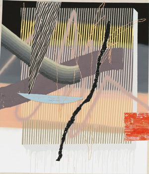
Trudy Benson could figure in anyone's tour of the possibilities, with her own expanding catalogue. She has turned to mixed media and offered up her Computer Painting before AI art threatened to take away her job—and here she is again with her own hand. Thin curves of thick paint weave across the surface, atop brightly colored rectangles. Frank Stella quipped that he only wanted to make his paints look as good as when just squeezed from the tube, and Benson may have taken him up on the squeeze. Beneath them all, tight arrays of rectangles define and distort the grid—like curved sheets in space or curved space itself. The successive layers pop right out of the picture plane, float within it, and undermine it.
At the same gallery a few doors down, Michael Reafsnyder has his own shifting foundations, but right up on the surface. He also has no need for a catalogue in order to say it all. Like David Reed, he can make a brushstroke look like a brushstroke. White mixes into black in shifting proportions, like highlight and shadow. Acrylic has changed a great deal in fifty years, and one no longer needs oil to capture the light. It can reflect light as well, like resin, in more polished black.
Intermixing adds raw color as well, seeming to emerge from blackness and a greater depth. Whether you call this illusion is up to you. The layers of paint are real. These are large, tall paintings in the manner of art from the 1950s, with the focus on paint as both physical and visual. There is no one motif apart from the entire surface. If artists once left their signature, in floating rectangles and drips, Reafsnyder effaces it.
Is he still trying to say it all, without an index or catalogue? A third artist has no need to try, and her work is all more impressive for that. Andrea Belag does have her signature motif—and, as with the older generation, it arises from painting broadly and paring back. Arcs in simple, bright colors capture the eye and center a painting. They could even stand for the eye, from their shape and their access to the artist's vision. She has her focus, and that will have to do.
Belag works just larger than many an easel painting, but that, too, is part of her focus. In fact, she shares her scale with target paintings by Kenneth Noland and recalls his signature. She makes direct reference to another painter with a fondness for curves as well. This show is "Twombly's Green," after Cy Twombly. She does not, though, restrict her choices to green and she is not doodling. Rather, she is mixing and layering curves the width of a brushstroke, leaving plenty of off-white ground.
Additional paint in the space beneath the arc has a layer to itself below and beneath, like a solid plate. It could be what the eye sees. Regardless, color and focus still matters: maybe the first generation of postwar abstraction was not so bad or so dogmatic after all. At the very least, its turn to color-field painting came about from women like Helen Frankenthaler. Whether the present generation of "anything goes," dogma, and diversity can have the same impact remains to be seen.
Big girls
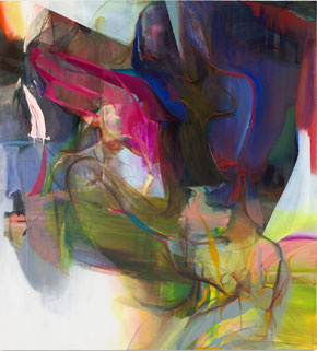
Grace Carney cannot get enough of women. Her show's title insists on it, thrice over, with "girlgirlgirl." You just may not notice them right away or see them all at once. Her stained colors command attention all by themselves, at least for a moment, and continue to reward attention after that. They recall an era when color-field painting alone sufficed to go big. Still, they temper their breathless good cheer with female bodies in the present. They invite one to ask when drawing becomes painting and flowing paint becomes drawing once again.
More and more galleries have been pursuing diversity by looking back. They keep returning to postwar abstraction and the women who made it, all the more so if those women suffered neglect along the way. Just this year, a gallery called its winter group exhibition "Perseverance." What sets these artists apart, and can gender alone explain their neglect? After all, Frankenthaler and Joan Mitchell made history while inventing color-field painting, taking Abstract Expressionism to a new level, and historians have taken note just fine. After all, too, trends do become stale, so why look back?
 A little skepticism is all the more important when the artist is not neglected but just breaking through. Carney, now at a Tribeca gallery with a history of its own, received her MFA as recently as 2022. One could almost read the show's title as "You Go Girl." Is the going now easy? At what point does the back and forth between realism and abstraction become itself a cliché, a means of mythmaking twice over? Carney, though, sees them as far more than myths.
The artist combines lots of color with ample white space, giving her shapes room to expand. Pours and brushwork themselves expand outward in translucent swirls. They suggest Morris Louis, but the light colors never run together to the point that they become his darker veils, and symmetry is out of the question. Carney is asking not for late Modernism's rigor but only its paint. Her overlapping marks violate an older generation's demands for both flatness and space. They have to do so, to let the images emerge as women.
Eddie Martinez, for one, masks everything about his figures but their faces, as "Wavelengths." His Whiteouts start with group portraits in the Brooklyn community he knows best, much like Henry Taylor. Then he paints over them, like his Flower Pots, with plenty of white. White can surround a face like a halo. Black and color still peek through, in a contrast that recalls the youngest of the old Abstract Expressionists, Richard Pousette-Dart, as much as acts of erasure. They express the effacement of people of color, but also their pleasure in just hanging out.
Carney, in contrast, is serious about the body. She treats big girls not as characters in a mythic narrative, but rather as figure studies. They twist and turn freely, as if to hide, although faces appear as well. Their closeness to the picture plane may come closest of all to Joan Semmel in her nineties. Maybe Carney is not satisfied with the appeal of the emerging artist after all. Who knows what comes next, after the good cheer is gone?
Thinking in black
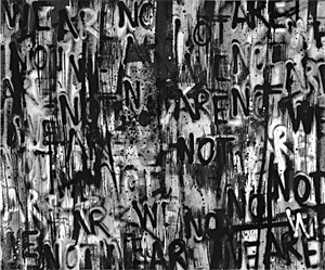
Adam Pendleton is always politically aware, but never in a way that you might expect. He made his name with text paintings, quoting prominent black Americans or simply the word BLACK, like a history of America in graffiti and spray paint. Naturally he covered every inch of the lobby of the New Museum for a show of "Art and Mourning in America," and naturally it was all but illegible. Could that make him the natural candidate for a full-bodied abstract art? For MoMA, the graffiti was gone, leaving only a video and a tenement fire escape running the height of the atrium. For the 2022 Whitney Biennial, text and a recognizable image alike vanished.
Pendleton is still thinking aloud, with "An Abstraction." The smears remain, but as ghostly compositions. Colors echo the electric tone of black enamel. Diagonal partitions convert a prominent Chelsea gallery into a maze, with repeated warnings not to step too close. The work is coming right at you all the same, stepping into and out of time. Time itself may have tricks up its sleeve when it comes to racism. Pendleton at MoMA also captured the statue of Robert E. Lee in Richmond and its fall—and now a Virginia community is returning the names of Confederate leaders to its streets. 
Another artist at age forty stakes his career and his sanity on black abstraction as well. And he, too, plays with proximity, distance, and the material reality of paint. Chris Watts may add wood slats to his work, suggesting if only for a moment a view of the stretcher from behind. Other works have dark wood frames and their echoes in brushwork. He adds enough layers of resin that the entirety seems under wraps. Five tall paintings fold into nearly a circle, but with an opening.
Even if you do not or cannot enter, their sheen might enclose you. And that sheen is more than half the point. One series incorporates lapis lazuli for its brilliance. Another seems to paint the sky. Watts describes the work as in religious tones, with the precious stone an emblem of the spiritual. Maybe so, but it is painterly and physical.
These days anything can go into a painting, but not everyone is comfortable with "anything goes." A painter and teacher whom I trust dismissed the show as "student work." It comes down to a dilemma that I face in review after review here. My heart is still in abstraction, but I still struggle to know what of it is any good. Yet I also argue for proper criticism as about more than judging. Who cares about the "originality of the avant garde" anyway?
The dilemma takes on special urgency for abstract art, which necessarily turns questions of form into questions of value. If a show borrows from past art, is it merely "derivative"? If it does not, how can it foreground the elements of its art? A white artist, Suzanne McClelland has been asking touch questions for years and rewarding them with brushwork and beauty. Her latest made me think of Lee Krasner, with black structuring her colors into something close to tiling. How else could the rich repertory of painting contribute more than a formula or a mess?

Trudy Benson and Michael Reafsnyder ran at Miles McEnery through May 11, 2024, Andrea Belag at Steven Harvey Fine Art through April 13, Grace Carney at P.P.O.W. through February 24, Eddie Martinez at Mitchell-Innes & Nash through March 9, Adam Pendleton at Pace through August 16, Chris Watts at Galerie Lelong through May 5, and Suzanne McClelland at Marianne Boesky through June 8.


