The Not So Great Recession
John Haberin New York City
The 2010 Whitney Biennial
If I hear this one more time, I am going to scream. The recession is good for artists. Think so? Head to the 2010 Whitney Biennial, and you will scream, too.
The Whitney itself spread the word, calling this the recession biennial. With just fifty-five artists, it shows true restraint. It also tracks trends, which is what a biennial should do. It is, after all, both a curator's vision and the state of the art. And yet the combination of a narrow vision and trendiness is stifling. Maybe the Great Recession is not so great after all. 
Surprise me, big boys
The Biennial's muted, scattered design only begins with the number of artists—although with more emerging artists soon to come at MoMA PS1, for "Greater New York" or with "The Ungovernables" at the New Museum after that. Just try to pin it down. A small show packs a museum to the gills, an intriguing forecast of the 2012 Whitney Biennial or 2014 Whitney Biennial, with few established names but entirely within the system. It gives extraordinary weight to painting and video, but it feels like an installation. It hectors and lectures, again and again, but it avoids taking sides at all costs. No wonder one reviewer described the Biennial as devoted to conceptual art, while another saw "tweaking" of traditional forms.
Of course, it is restrained—and for good reason. Past biennials have had bracing, confrontational themes, while this is a time for taking stock. They have spilled over into Central Park, where Roxy Paine planted a steel tree, and to the Park Avenue Armory, where Ernesto Neto has given the curtained interior the shape of a living organism. They ran to at least a hundred artists, and they felt like treasure hunts inside and out. Now people everywhere are coping with going home empty-handed. When Roberta Smith worried about too many spare installations, she worried about a new paradigm, but curators good and bad alike are making do with less.
Still, the 2010 Biennial fills five floors, spilling out front into the basement courtyard. Right in the lobby Martin Kersels stacks speakers, mikes, and chairs, like moving day at a recording studio. Daniel McDonald's sculpture blows smoke, apparently from hell, while Charon ferries the souls of Michael Jackson and Uncle Sam to the afterlife. Jeffrey Inaba's tentacled balloons serve as enormous chandeliers for Danny Meyer's latest museum café after the Modern. Outside, Theaster Gates piles up shipping pallets, along with a shoeshine stand and a vintage lamppost. Speakers faintly intone some forgotten chant.
Already though, one has seen it all before—and much more clearly. Kersels mimics any number of installations from Nam June Paik to a month before at Andrew Kreps gallery, and it looks still unpacked because it is. McDonald mimics the Chapman brothers, and he says nothing in particular about America. So what if Uncle Sam forgets to pay for passage across the river Styx, while Jackson carries a big, shiny coin minted by Uncle Sam? Gates may refer to black servant status as shoeshine boys, to the deep history of Western culture, or to nothing at all. Inaba might as well be recasting Neto as a luxury good on its way to the recycle bin.
Upstairs, too, even the obscure looks all too familiar. Alex Hubbard beats up a Ford Tempo, while Gabriel Orozco at MoMA sliced up his car back in 1993. The Bruce High Quality Foundation adds a white stretch limo as ambulance, while Nari Ward has a real ambulance in Chelsea. Hannah Greely's old-fashioned restaurant booth echoes George Segal, but Segal's white-plaster figure has long gone. And so it goes, again and again and again—Storm Tharp's works on paper in the style of Goth film posters, Robert Williams's watercolors out of Bay Area graphic novels, Aurel Schmidt's cartoon and very male minotaur of blood and spit, and so much more. They have their charms, tweaked or not, but tweaks can go only so far.
The Biennial has few hot artists, beyond Huma Bhaba, Piotr Uklanski, and the Bruces. It is likely to anoint few more, like Dawn Clements, who also brings her large ink drawings to the Boiler in Williamsburg. Its older names have mostly cult followings, like George Condo and Condo drawings. One can welcome the effort to lower the hype. Even then, however, the show not only looks familiar, but also relies on a handful of prominent dealers. It is as if the curators went to the wealthy and said, surprise me.
Lectures, dancing, and posturing
Perhaps the curators are just catching up themselves. Francesco Bonami, an independent curator born and based in Italy, has long worked at MOCA in Chicago, and he approaches New York almost like a foreign country. Gary Carrion-Murayari, a senior curatorial assistant at the Whitney, is given a shot, too. They may be hoping to level the playing field, even if few teams make the final cut. They lean cautiously on top dealers, but many are from outside the city. For the first time ever, a majority of artists are women, although race largely falls by the wayside.
Still others are born outside the United States, based abroad, or both. In the past, such choices in a biennial of American art have provoked controversy, and rightly so, but this is a quiet affair. The revolution will not be televised. It will also not enter the Whitney. For those wishing to nap through it all, the museum stays open twenty-four hours for three days in May—a conceptual work by Michael Asher. Asher planned on a week, but this is a recession, even during clubbing hours.
In sum, cutting back does not mean cutting back on familiar trends. Rather, it means muting them to the point of incoherence. In the case of the lectures, make that shouting them. Marianne Vitale barks commands and insults. (She says that her video "parodies authoritarian posturing," but no matter.) Ania Soliman even calls her vague, text-heavy montage Natural Object Rant.
In performance, Aki Sasamoto talks nonstop about fractals, donuts, and whatever else strikes her fancy. At one point, "I went inside my mouth." Over several screens Sharon Hayes even combines several lectures—on the validity of sentimental art, homosexual rights, and her own declarations of love. The title, Parole, adds a lecture of its own on structural linguistics. Reading her love letter in public parks and in several cities, she bridges certainty and confession, like Sophie Calle or Andrea Fraser. Her rootless self-exposure and questioning others would make this an outstanding work, if only the long lectures did not swallow it up.
The lectures also hint at a second theme, personal identity. In photos, Tam Tran's nephew plays superhero. Videos include Rashaad Newsome's gay "vogue" dancing, Kelly Nipper's slow masked witch dance, Kerry Tribe's two-channel history of an epileptic who underwent radical surgery, and Jesse Aron Green's forlorn gym class, inspired by a nineteenth-century psychiatrist's "cure" for sexual desire. In my favorite hands down, Kate Gilmore fights her way in high heels out of a box. An actual Sheetrock pillar serves as evidence, scarred but with no exit. Perhaps she never made it out alive—and if she did, she would only get a lecture.
The Bruces combine lecture and installation. Their Cadillac hearse refers to a trip by Joseph Beuys to America, although you may not care why. Found video on its windshield and a soundtrack riff on America. The artist collective is also holding its own "Brucennial" in Soho, but huger. The Foundation has a sharp, funny ear for mass culture and the art scene, as last summer on Governors Island. Here, though, it blends into the Biennial's unfocused search for a trend.
Abstracting from politics
You will have spotted a third theme, politics—but politics as seen through the eyes of individuals. It can be moving, self-effacing, or evasive, sometimes all at once. I felt the urgency of personal experience, but never the urgency of events in the real world. The problem begins with the flip title of that white ambulance, We Like America and America Likes Us. (I am sure.) It reaches to the actual erasures of Curtis Mann, who reduces photos of downtown Beirut to abstraction.
It extends even to Josephine Meckseper's ominous video tour of a shopping mall, parallel to the "Gulf futurism" of Sophia Al-Maria. It extends, too, to the Biennial's only real concern for blackness. Lorraine O'Grady, born in 1934, probes identity through paired images of Michael Jackson and Charles Baudelaire—who called his Haitian mistress his "black Venus." Questions of race, femininity, life, and death motivate her. But as downstairs with McDonald, is Michael Jackson all there is to America? When O'Grady calls the series The First and Last of the Modernists, is she anywhere close to right?
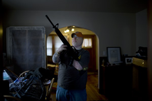
More personal and disorienting are Stephanie Sinclair's burn victims in Afghanistan. Nina Berman, too, gives a personal account of politics, in an American soldier disfigured by combat, his face eerily like Mr. Potato Head. I shall remember both photo series a long time. Even so, it is as if war and genuine controversy are off-limits at the Whitney. The women's wounds arose from another horror, self-immolation. The man's marriage acts out the rural male reticence in contemporary American fiction—or People magazine, which commissioned the work.
A fourth and last theme is abstraction, caught between painting, photography, craft, and conceptual art. Charles Ray has given up his sculpture's Pop Art conundrums for floral patterns. He loses something in the process, even as he revels in the obvious sentiment. Much else, though, is just plain beautiful. So what if one has seen graphite spills like Roland Flexner's or Lesley Vance's brushy oil on linen, though more often as photo manipulation? So what if one has seen black-and-white spikes far too often before, as with Harvey Quaytman, if sewn together this time by Sarah Crowner?
I think it does matter, much as I enjoyed impressive abstractions by Tauba Auerbach. Her synthetic polymer recreates the fall of fabric, to modulate shades of a single deep color. They, too, make it difficult to know abstraction from photography on the one hand or trompe l'oeil on the other. Still, the Biennial's lack of imagination makes them, too, seem familiar. Even for quiet, near abstract landscapes by Maureen Gallace, I kept wondering which older modernist had painted the houses. Have we all been here before?
The same question haunts works that do not easily fit the themes of an officially unthemed Biennial. People who like big, hulking handmade sculpture will like a crouching monster from Thomas Houseago or Uklanski's "textile painting" with a massive red-vinyl lollipop in front. People looking for subtle changes on male identity and vulnerability will admire David Adamos's installation of an axe, knives, whittled canes, and a violin case. Those sick of macho gestures will not. And what does Jessica Jackson Hutchins mean by papering a sofa with headlines about Obama, then topping it off with ceramic jugs? Is she inspired by craft traditions and a black president—or by one cliché of contemporary art after another?
The maze of contemporary art
Thankfully, there is more—if only a little. Emily Roydson (now Every Ocean Hughes) and her photographs of chairs and decaying Hudson River piers create a disturbing montage of open spaces. Babette Mangolte has been documenting the downtown scene for over thirty years, although the photo installation takes some deciphering. R. H. Quaytman gets a whole room to herself. She alternates abstraction and standing nudes in gesso, oil, screen prints, and diamond dust. The abstractions echo the trapezoidal corner window, with the immediacy of the body and the distance of a white haze.
They also raise the paradox of Marcel Breuer's architecture, for the Biennial has one last contribution to make, its installation. The three main floors each have a signature work on the wall off the elevators and a large work just inside. Other rooms branch out from there. Many biennial artists get more than one wall, with up to thirty works. That is a nice price to pay for fewer artists, just as for Sinclair, Berman, and Quaytman. The thoughtful design sets a tone for each floor.
Yet here, too, very good ideas come with nagging questions. It allows each floor to lose its way. The second floor opens with two large prints by another established artist. James Casebere shoots his own cardboard models of tabletop villages. Their strong color, familiarity, simplicity, and emptiness echo in Gallace's landscapes later, and these in turn bounce off photographed landscapes by Josh Brand. The floor's big work, a metal fence and arched bridge by Robert Grosvenor, picks up the theme of Minimalism's landscape—at the cost of reminding one of the sorry state around him.
The bridge's red fabric bumps could pass for cobblestones. The pairing also creates divisions within a room, echoed by monotonous divisions like Vitale's authoritarian lecture. The third floor opens with a Pae White's mural-scale photo tapestry of smoke swirls, anticipating the blend of photography and abstraction upstairs. Pretty as it is, it also made me wish for a real illusionist in paint, like James Nares or Mark Sheinkman. Next comes a big box into which one can stumble, by Edgar Cleijne and Ellen Gallagher. Its meaningless video inside goes all too well with meaningless lectures in text on the outside.
The fourth floor starts with Uklanski's overblown, tattered carpet and the white ambulance. It all connects, but it also makes one aware of how, say, the third floor's videos branch off like a maze. The separate chambers also emphasize how little the film-like videos experiment with new media. The Whitney leaves the fifth floor to the permanent collection—all acquisitions from past annuals and biennials. True, the highlights of American art mostly came from elsewhere, but Edward Hopper holds the record for past appearances, including that of Early Sunday Morning and, coming up, Hopper's New York. The floor should provoke gossip, too, over what this biennial will bring to the market.
I took that opening line about the recession's not helping artists from "#class," a recent exhibition organized by Jennifer Dalton and William Powhida. I had been thinking it, though, for months. Going through the 2010 Biennial, I kept wondering how I ever made it through a larger one, with twice as many artists. And then I wondered if there is an exit from the maze. Is this all there is to contemporary art? No, it is not, and it is the dullest biennial I have ever seen.

The 2010 Whitney Biennial ran at The Whitney Museum of American Art through May 30, 2010. Other reviews look ahead to the 2012 Biennial, 2014 Biennial, 2017 Biennial, 2019 Biennial, 2022 Biennial, and 2024 Biennial—or back to the 1993 Biennial, 1997 Biennial, 2000 Biennial, 2002 Biennial, 2004 Biennial, 2006 Biennial, and 2008 Biennial.


