Politics off the Wall
John Haberin New York City
Allyson Vieira and Ishmael Randall Weeks
Kevin Zucker and Caitlin Masley
Gallery installations have become ever so grand, so ubiquitous, and so trashy that painters and sculptors have come to fear for traditional media—and their lives. Maybe it would help to rename the installations architecture.
Sure, it would be architecture on its way to collapse of its own accord, but there is a name for that, too. Critics sometimes speak of deconstructive architecture, to label a high-blown trend a few years back in buildings that may or may not ever get built.  It sounds like a cross between academic jargon and a line from Get Smart: "this duct tape will deconstruct in fifteen seconds." It had a point, though, for it asked to reconsider the politics of architecture. And that includes big spending and its results.
"9 + 1 Ways of Being Political," a recent show at the Museum of Modern Art, looked back at that and other approaches to urban planning. Yet contemporary artists have their own politics of architecture, with something closer to abstraction. They, too, have every right to worry about who gets to use public and private spaces. Rather than showing off their ability to destroy a gallery at great expense, some flaunt their modesty and indirection. Rethinking an installation as architecture has the advantage of calling attention to the gallery and its purposes. It also has the advantage of leaving a residue, in the art object.
Look long enough with Allyson Vieira, and you may wonder if you have seen the actual supporting pillars, Mannerist sculpture, or an intriguing mess. Look long enough with Ishmael Randall Weeks, and you may see a blueprint for not just the gallery, but Third World politics as well. Look long enough with Kevin Zucker and Caitlin Masley, and you may see architecture in the process of dissolving or flying apart. Then again, you may not. With Zucker, you may not even see an image. You may even prefer it that way, but at a cost, in no longer seeing the politics.
Slaves of New York
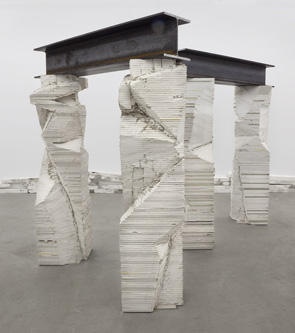
Who knew that it took such effort to hold up a gallery? Allyson Vieira all but fills a gallery with drywall pillars. They come in pairs, angled in all directions to fall where they may. They also come in no need of metal studs. One can see plainly each layer in its stack, piled roughly to eye level from the floor. One can imagine her shaping the thin sheets individually, or one can imagine a rectilinear column that one will never see, brutally or carefully hacked away.
Not sure whether to opt for the second? It may help to stumble on two larger sheets of battered drywall against a far wall, slathered roughly with plaster and enigmatic signs. Here metal does lie behind—but as contrasting materials and color, not support. The whole could pass for sculpture, expressionist painting, or simply a mess. The columns, too, could belong to an ongoing construction site, as in fact the gallery's second exhibition in a new location. Its façade is still in progress.
From a different angle, the columns look twisted, torn, and human. I thought of the dying slaves by Michelangelo around 1515 for a tomb of Pope Julius II. It makes sense that the slaves of the Lower East Side hold up hefty steel beams as best they can. Michelangelo never finished his project, but then I-beams at eye level will never hold up a gallery either. Last time out, Vieira adapted Minimalism to a model of the Parthenon. Its fabled symmetry, like Michelangelo's early classicism or the neighborhood before gentrification, is not coming back.
Wood studs form yet another bit of flaccid architecture, running along the floor. More leftover beams, again roughly painted white, stack in diminishing squares over unfolding rolls of silvery Mylar on the floor. They, too, confuse walls with windows, architecture with sculpture, and geometric abstraction with its stretcher. They also come in a pair, on two different walls. They define the gallery as a work in progress and a mirror image of its art. I have already made them sound more final and aggrandizing than they are.
Deconstructive architecture like that of Lebbeus Woods has been creeping into art often lately, as with Cordy Ryman or Joshua Neustein. If that seems ever so theoretical and conceptual, it is also a way of returning installation art to something plain, material, and painterly. With Vieira, it even toys with imagery. A more or less conventional sculpture, in cast bronze, combines a winged penis (excuse me, phallus) and an octopus. The show's title, "Cortège," also cites the poetry of Guillaume Apollinaire and Surrealism—like two weddings, if you will, and a funeral. If all this mythmaking sounds way too pretentious after Vieira's real threats, it is, but she still looks good in white.
Architecture also runs through work by Sharon Lawless, and it may well have freed a fine abstract artist for even finer things. Two works cast a knowing wink at the ever so sophisticated and now ever so dated interior decor of fifty years ago. The largest covers two walls in staggered rectangles, alternately framed and unframed—and occasionally bursting their bounds. The imagery from architecture, biology, engineering, economics, and thermodynamics includes all sorts of steady-state systems, none of them all that steady. Drawing often riffs on collage, and vice versa. Lawless has been at this a long time, as with an early collage in the show, but she may never have broken so fully into the gallery.
Quoin tricks
When Ishmael Randall Weeks creates the ruins of ancient civilizations, he is not looking back. A fragile gray table thrust up against a wall holds a gray sculptural geometry. The crowded city has room for its monuments, compressed into an oddly small space like collectibles. It looks impressive, even with pyramids shorn of their peaks, if neither exactly grim nor monumental. Paper pulp lends the gray a lightly mottled tone. One may wish that one could pick up the pieces and start reading, perhaps to learn their history, but this text has had to sacrifice its words.
Randall Weeks has a reputation for found materials, especially magazines and books. Not that he is all that worried about recycled paper or even book art. Rather, he is mapping physical spaces and their human history—in words, objects, images, and memories. Not surprisingly, he also ends up dislocating them and, just maybe, the viewer. He calls an entire show "Quoin," and he could well be happy that I had to look the word up. For the record, it means the brick and stone of architectural corners and angles, not unlike the gray.
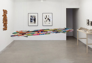
 Politics is very much a part of this history, only not so easy to pin down. The ruins may or may not refer to the artist's birthplace, Peru, and capitalism or imperialism may or may not have contributed to their decay. A signature work cuts and shapes a small paperback library—something of a guided tour of Latin American art, Latin American architecture, and politics all by itself. It has something in common with Renée Green's hipster college course, Import/Export Funk Office, in "Blues for Smoke" at the Whitney. Suspended from the ceiling, its mass could pass for an aircraft carrier on patrol of Caribbean art. On the other side from the spines, its layers become geological strata.
Two works approach painting, with just as elusive a history. One shares its small rectangles, their irregular placement on the wall, and their soft brown with the sepia-toned photographs of Lorna Simpson. Actual photographs, both on the wall and projected as an old-fashioned slide show, travel through distant landscapes. Randall Weeks outlines a roughly trapezoidal portion of each, whether finding or imposing a cryptic order. Cuts, Burns, Punctures, a projection in the marvelous basement "lab" of the Drawing Center, is that much more vivid but just as anonymous. It seems only right that the slim film loop keeps getting caught in the reels.
Becky Beasley and Alicja Kwade, too, move between formal and global spaces. Beasley calls her three black Plexiglas sheets, slightly cantilevered from one another on the floor, her Steppes. Two photos of organic waste heaps in Athens seem displaced between continents and between nature's course and humanity's footprint. That theme continues in a postcard rack, which also takes one to her native United Kingdom. The plants may grow just as they appear on each one, but they seem right out of the tradition of English gardens waiting for the sun. And then the back gives them a stricter scientific description, with room no doubt for your address.
Kwade's displacements stick to the space and time of the gallery, even as more pretentious art stars like Doug Aitken and Urs Fischer are knocking them down—and, in the case of Urs Fischer, gentrifying as well. Bronze pipes twine together as they rise on the wall and spread out on the floor, while a white door curves back into a column, as if to support the actual ceiling or to shut on itself. A mirror lies shattered, its pieces still almost fitting together into their rectangle—already an exemplar of entropy, that favorite word of Robert Smithson, and yet defying it. And then one notices a second mirror elsewhere with exactly the same shapes and cracks. Its reflection in a third mirror, she suggests, could explain everything, except maybe an actual makeup mirror bent archly nearer the entrance. Different as they are, these artists share their Minimalist spareness and materials, like maps of the Lower East Side abstracted away from the bars and the galleries.
No tell hotel
Another room on the Lower East Side has only sheets of hotel stationery, from seemingly everywhere, with cryptic messages in full capitals. They may take the form of stories, commands, casual asides, or bare lists. They could be the notes of a forgotten writer, working late at night on the road, or telegrams from a spy. Kevin Zucker insists that they describe photographs found online—photographs that one will never see, although one can try to picture them. In fact, he calls the entire show "No Hotel." Apparently, nothing is in the eye of the beholder. The other room of Zucker's gallery has paintings, in spare streaks of color on white. The streaks run just off the vertical, barely punctuating the seeming abstractions. Up close, the streaks are far less pale. They are also composed of dots that, like most pixels, stand for something. Step back, and one can discern the real subjects, resort hotels in the rain. One might try frantically to connect them to the costly and exotic logos on the stationery, but Zucker has made them up, as further "snapshots from trips not taken" and things unseen.
I know all this because I read (and have just quoted) the press release. Without it, I might never even have spotted the hotels, all of them devoid of life. You could call them a last resort. I learned, too, that the blank hotel stationery comes from a posthumous artist's book, by Martin Kippenberger. Together, the projects pursue the hotels as fantasies several times over—of each artist, of the viewer obliged to piece them together, and of the unseen vacationers back in the days of typewriter font. At the same time, the fantasies or even the hotels could be dissolving in pixels and the rain. If so, they would leave abstractions, somewhat dry conceptual art, and a mystery.
They would also leave Caitlin Masley. Her title, "Abandonment of the Solid," suggests something just as evanescent, but she is at her best in the material world. She claims to base her images, too, on architecture—"experimental and abandoned geo-political architecture," she explains. This time, I could not spot them no matter what I did, either stepping closer or stepping back. Instead, I saw jagged planes of black and warm colors in headlong collision. They occupy works on paper, but they come alive on a larger scale, when they take over gallery's main space.
Some cover two adjacent walls, in pigment, while others busily intersect as foam-core sculpture. From a distance, the two components blend together, somewhere between two and three dimensions. As with Vieira, Randall Weeks, and Zucker, they also fall somewhere between abstraction and architecture. Where Zucker's images are atmospheric and deliberately distancing, hers are solid and inviting. Both, though, insist on the political dimensions of modern architecture—his the politics of consumerism and escapism, hers the politics of housing projects and geodesic domes. One could recall deconstructive architecture, the postmodern movement that sought political critique in unstable or incomplete forms.
Deconstructive architecture may or may not have accomplished much. One could question these artists, too. Exactly what about her images identifies them as "geo-political" or says anything at all about politics, and what if his politics comes down to art about art? What happens when one has to read the press release to see content at all? Does it deepen both shows to see them as conceptual art, or is one better off with their visions and materials? I am not sure, but art is supposed to raise questions, especially when it is coming together and flying apart.

Allyson Vieira ran at Laurel Gitlen, through March 24, 2013, Sharon Lawless at Robert Henry through March 17, Caitlin Masley at Lu Magnus through February 3, Ishmael Randall Weeks at Eleven Rivington through February 10 and at the Drawing Center through March 13, and Becky Beasley and Alicja Kwade at Lisa Cooley through March 17. Kevin Zucker ran at Eleven Rivington through December 22, 2012.


