One Size Fits All
John Haberin New York City
A Trillion Sunsets, Actual Size, and John Divola
For a brief run in 2011, a gallery offered a room that a little boy would have been delighted to call home. Now it offers a warm welcome once again, but to the multitude of images in "A Trillion Sunsets." It shares the International Center of Photography with the more literal big picture, in "Actual Size." Still not convinced that an arts institution can be welcoming? John Divola kept returning to abandoned buildings in California for the sunsets, a photographer's studio, and almost, just almost a sense of home.
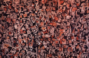
This being a little boy, the perfect bedroom was also a holy mess—and this being art, it took serious work up front. The exhibition title exaggerates, but only a bit. This was Foam gallery, in Amsterdam, but the boy's soft bed was not foam but pictures, thirty-five thousand of them. Or was it even work, in the virtual space that those under a certain age call home? Erik Kesels had uploaded them all to Flickr just the day before piling them on the floor. They came in every color, but a wall-sized photo of the installation, on ICP's top floor, holds out a welcome of its own, in fire-engine red. 
Clean up your room
A parent would tell you right away to clean up your room, and the show takes off from a century of art's scolds. Have smartphones ruined everything for everyone? Tabloid journalism had already threatened to bury the truth in sensation, and that was before TV and the Internet. Here we go again. For the curator, David Campany, art movements from Dada to Postmodernism were "horrified and mesmerized by the seemingly endless supply of images." Does anything, though, unite artists beyond their horror and fascination? Can anything hold the show together beyond the replication of images?
In line with the show's theme, one might call them the usual suspects. Andy Warhol appears of course, but with silkscreens of a "serious" artist, Joseph Beuys. And then comes Warhol's Jackie, up at auction and rephotographed by pomo's greatest scold, Louise Lawler. When Richard Prince snatches a woman's eye from advertising, he finds it in a compact mirror. One can almost hear him chuckling.
The scolds are torn within themselves as well, just as Campany predicts. Photo albums by Nakeya Brown and Sheida Soleimani cover cosmetic and fashion ads, too, but for an African American woman and an Iranian American this is also personal history. Hank Willis Thomas shows how product logos play off the "modern woman"—not just in the bedroom, but as a utility worker up high as well. Justine Kurland continues the project with enigmatic fragments of what men see. In her photographs of the open road, she has long merged the sensations of freedom and alienation. But then Robert Rauschenberg in silkscreens and Romare Bearden in collage had done so for decades.
The exhibition's lower floor looks back well before the Internet, Rauschenberg and Bearden included. Hannah Höch nurtured and subverted beauty in her Album (Scrapbook) of 1933, and Ernst Friedrich began earlier still, in 1925. Walker Evans had his Penny Picture Display in 1936. Robert Capa photographed an artist in the very making of a photocollage, while found images came with the territory for Robert Frank, as backdrop to a tattoo parlor. And the golden age of TV did indeed present a challenge. A dense wall of found images, from Harry Callahan in 1957, anticipates the image bed in Amsterdam—right down to a predominant red. It also anticipates Prince with its repeated human eye.
Was this celebration or critique? For those with an Orwellian view, of totalitarian states as a triumph of propaganda, John Heartfeld was happy to play their game. His photocollage from 1935 has German business leaders walking a tightrope and spreading fire. Bertolt Brecht collected Nazi images, too. Barbara Morgan channeled her anger into photocollage without once losing the thrill of a city at night. Alexandra Bell brings matters up to date after the killings at Charlottesville.
Such, though, is the problem. When everything has a place, does anything? What exactly is at stake—the cheapening of fine art, the Internet as a time suck, or photography as aggression, as for Susan Sontag? Is it all just fodder for a Web search for "photos" and "fotos," by Joan Fontecuberta, in what Guanyu Xu calls the Space of Mutation? What do artists do anyway other than to proliferate images? A grab-bag of a show mirrors the proliferation and its pleasures.
The big picture
ICP Photography makes it look easy, but the problems remain: when did the proliferation of images begin, and will it ever end? Where does the whole idea begin and end? It is not just as a philosophical question. Large titles on the lower floor direct one to "A Trillion Sunsets" at right and another show at left, "Actual Size." In reality, the first has a ways to go to on either side.
Not that one would know without labels. Rephotography of found images is necessarily actual size. So are magazines by such artist and collectives as Pacifico Silano and Lilliput UK. So are room-sized installations of postcards and posters by Sara Greenberger Rafferty, Claudia Angelmaier, and Patrick Pound. So, too, does a photocollage by Carrie Mae Weems, which could equally well be a color chart or an abstraction. The boy lying in thousands of images looks, to my money, close enough to actual size as well.
They are a fitting introduction to "Actual Size." Size, it turns out, is elusive, too. At least since the Renaissance, it is often an illusion. From the ceiling to the floor of the Sistine Chapel, it also depends on where you stand. Jeff Wall takes on that very issue with his grainy photo in black and white. It shows a figure not life size, but as the portion of the visual field that she would occupy, given the place of the camera.
Other work picks up where "A Trillion Sunsets" leaves off, with additional book covers and magazines. Take what comfort you can that the title on the wall for sunsets points to the west. The most memorable work, though, derives its impact from its improbable scale. Photography, it says, is not just true to life. It can rub one's nose in life as well. It can also make one take a giant step back to preserve one's distance and to take it all in.
Muhammad Ali's bandaged fist means to make an impact, in more ways than one. So does a hailstorm for Schindly Photo in 1910. It looks more like dirty snowballs. Manuel Franquelo sticks to a modest subject, with Things in a Room. So does Aspen Mays with Dodging Tools—maybe just the tools that she needed to produce a photogram. But things get bigger fast.
One could almost breathe in the earth and vegetation, in a photo by Tanya Marcuse. A Greyhound bus by Mason Williams is all the more memorable for its flatness, on a sheet pinned to the wall. How did he do it? Paola Pivi leaves no doubt, in an ongoing project based on an Italian island that has grown to more than a quarter mile across. As you may have surmised, Jorge Luis Borges inspired the show with his parable of art as the demand for a map so precise and accurate that it, too, has reached actual size. After all those centuries of art as a mirror or window onto reality, could a truer metaphor be a map?
Swimming in light
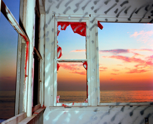
Some things never change. When John Divola exhibits two series together, from forty years apart, one could merge their one-word titles into a single revelation, Zuma Daybreak. In the first, photos overflow with light and color from sky and sea. The view from an abandoned building can hardly contain them, although windows and walls have an intensity of their own. And then a second series turns to black and white with much the same perplexity of inside and out, rebirth and decay. If you no longer know which is which, the photographer himself, the show's title has it, is "Swimming Drunk."
Daybreak here lasts a long time. Divola came upon the first property in 1977, in his late twenties, and he kept returning to it over the course of a year. It stood in Zuma Beach, in Malibu, better known for expanses of sand and surf than for abandonment, but they flow easily together. Photography can transform one into the other at that. Churning waters all but merge with the the ratty frame of a door or window. Interior light and paint compete with the white of clouds and sky.  Together, they send the ultimate in mixed messages—but then Neil Young, who recorded Zuma two years earlier, had an aversion to unspoiled pleasure, too.
Divola persisted through the course of a day, from the crack of dawn to afternoon sunlight and a wilder sunset. As months passed, he made his own additions as well, including spray paint and artificial lighting, for patterns that seem to float or to burst off the walls. He had an assist from vandalism, wear and tear, and the fire department, which had used the building for training exercises. It is hard to know who took an axe to particular scenes—they, the photographer, or no one at all. Nature and human intervention each has its glorious excess, while the sobriety of black paint and interior shadows helps rein an unnatural nature in. So does the grid of architecture and windows.
The second series makes use of smaller sheets, the kind used for contact prints, in a gallery room often set aside for a different artist entirely. One could mistake it for Divola's first approach to the theme or his inspiration in photography's past. That would overlook how color entered the mainstream precisely in the 1970s, thanks to such photographers as William Eggleston and Stephen Shore who harped on saturated hues and unnatural light. That was also the time of Minimalism and the grid. Divola largely abandons those points of reference for "Daybreak" in black and white. He began in 2015, right after a show on very different themes, and he took until 2020 to complete the series. Still, one can wonder just how much in forty years has changed.
The setting in an abandoned building is back, but more confining, and his interventions intensify. Graffiti is that much harder to tell from a shower of sunlight or a density of shadow. Windows are fewer, and he may give over a print to an interior wall draped with what might pass for a work of art. Rather than a grid, it may display raw cuts like those of Lucas Samaras in paint. Samaras, though, never shreds the display space or calls it home. In the course of five years, Divola has made the room his studio, and a ghostly self-portrait appears faintly at least once.
It is still swimming in light and excess, though without the sea. Divola has moved inland to a cold war relic and abandoned air force base, for "The Ghost in the Machine." Where the earlier series has the color of a psychedelic dream, this scene looks like a war zone, apart from bursts of sunlight, vegetation, and his own startling sprayed colors showing through real holes in the walls. In reality, it was once housing for men on the way to war. The one bit of verbal graffiti calls it Sleep Without Dreams. It is past daybreak all the same.

"A Trillion Sunsets" and "Actual Size" ran at the International Center of Photography through May 2, 2022. John Divola ran at Yancey Richardson through May 21, 2022, and again through February 22, 2025.


