Hyperactive Art
John Haberin New York City
Jon Kessler, Catherine Sullivan, and Other Hysterics
At least since Modernism, art has taught a healthy distrust of what one see and what one knows. Or make that the stability of what one can know. This fall, contemporary artists are still shaking things up. In fact, their works are collapsing out from under them.
American idols
They can hardly help it. Even New Yorkers able to stop surfing the Internet long enough to visit Chelsea face the gallery scene's short attention span. But of all that hyperactivity, how much stems from the hypercharged art world and how much from the new media themselves? How much amounts to the conditions of postmodern life and how much to art's longstanding critique? A fall 2005 gallery tour may suggest the possibilities—if only I can remember the question five paragraphs from now. 
With Jon Kessler, The Palace at 4 A.M. rarely stands empty. Piled-up TV sets flash from all sides, and shifting mechanical arms create a parable of America as a relentless din. However, Kessler hardly has a monopoly on mania, not in Chelsea these days. Catherine Sullivan, like Reynold Reynolds and Patrick Jolley, even makes it her theme. Meanwhile, James Hopkins, Daniel Rozin, and Diana Kingsley supply a brief history of how art got to this point of collapse. They serve as a formidable challenge not just to perception, but to art's relentless struggle for attention and entertainment value as well.
What you think of Jon Kessler may well depend on where you begin. If you forge straight ahead into P.S. 1's south wing, you face quite an assault. As in a psychotic episode of the evening news or an unearthly video by Paul Chan, soldiers enter combat, the Twin Towers vanish again and again before one's eyes, and George W. Bush offers his chillingly blank, prefabricated smile. One can hardly look away or take it all in, and I could forgive you, along with Michael Kimmelman in The New York Times, for dismissing it as "agitprop." One could write it off, too, as another fashionably manic gallery display, now that gallery-goers have so little incentive to stop and look. Kessler does, after all, exhibit with Jeffrey Deitch, along with Madonna, Cory Arcangel in tribute to video gaming, and roller-coaster visions of New York by Barry McGee and SWOON.
Then again, you could enter through the side chambers that encircle the large center room. I did, and I found no overt politics, fewer ready-made images, and little clue as to how the parts cohere. Cameras stare through abstract, cutout frames, akin to stages set for marionettes. The cameras map the space and even the surrounding Long Island City streets, keep visitors under less-than-steady surveillance, and render the results barely recognizable. One soon discovers a one-to-one relationship between the cameras and monitors, not necessarily in close proximity or easy to match up, and one soon comes to enjoy the treasure hunt. One becomes simultaneously the subject of a multiple-channel video, a participant in its making, and an interpreter of how it gets made.
After the long route, the images in the central chamber necessarily seem less facile, too. They may look like agitprop, but for what? The more politically charged images merely replicate postcards and magazine clippings. Do they celebrate war, lacerate America as quite literally a cardboard cutout, or dismiss the entire debate? They may boil down to a catchy message from Jean Baudrillard—politics, culture, and indeed everyday life as a mere display—or intend a jolting reminder of the scars and old picture tubes behind the images. Alternatively, they may hold out hope through the visitor's active participation, much as the camera views through the windows ground an art institution in its surroundings.
Hyped and hyper
Kessler's clutter of used parts pushes Nam June Paik to far less homey extremes. Of course, his title refers to the Alberto Giacometti sculpture, which turns the mind's empire into a nightmare. Again the reference may or may not evoke art and America alike as crumbling global designs. The artist either misses or refuses the original's eerie silence. He mistakes his own impatience for profundity. Still, he has never before allowed this much room to play. Just do not try to determine whether the TV sets outnumber the images, elsewhere at P.S. 1, of Isabelle Huppert.
David Ivie takes one home in a still scarier version of American, but to a house in the woods that one never quite enters. He evokes those horror films populated by adolescents. Thick paint swirls everywhere, turning almost every appearance into a ghost. He is unlikely to startle anyone, but I liked that, too. One can keep a sense of humor about oneself and the picture show, while still lingering over the material surfaces for their lush gatherings of black, white, yellow, and red. He allows paint and allegory to restore some of Surrealism's silence, but do not unstop your ears too quickly yet. Other artists, believe it or not, are about to turn up the volume.
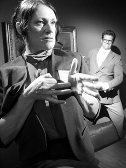
Catherine Sullivan definitely puts video through its fits, starts, and paces. But her version of what some critics have termed the New Cacophony at least has the sense not to depend on sound rather than gesture. Her sixteen actors on six screens in three separate rooms ignore one another. Perhaps they address instead the viewer, the artist's demons, the overwrought art scene, cinematic convention, or their own hyperactive imagination—but which? Lolling on the gallery carpet, I relished the ambiguity. One wants to accuse Sullivan of lacking in feeling, but her wild display turns the charge into a platitude.
The costumed characters all draw on old movies, where Mike Kelley draws on Superman comics and high-school yearbooks, but to much the same effect. One recognizes Hollywood's age-old vocabulary of hysteria—the overeager black servant, the gospel-driven inner transformation, the Frankenstein's monster animated by lightning, the one and only love. Sullivan's actors riff freely on their roles, while pushing each to absurd dimensions and numbing repetition. Her title, The Chittendens, refers to an insurance group and the lighthouse on one screen to its logo. Perhaps even an emblem of safety requires corporate sponsorship. It serves as a welcome commentary on some dreadful carryings-on just down the street.
Real mania hurts, and fortunately Reynold Reynolds and Patrick Jolley know the price of madness. On video, an attractive young woman stares ahead, distracted and in fear. Something in front of her torments her—or perhaps something in her mind. In shock or self-defense, she responds by tending to it, placing carefully before her the small apartment's scraps of food and life. Soon, unable to stand the stillness that she has created, she starts to fling everything around the room. And then the cycle of puzzlement, fear, claustrophobia, and anger begins anew.
Reynolds and Jolley give the video something of its character's dissociated world, with harsh cuts between raw color and grainy black-and-white. Eventually the woman, played by Samara Golden with the grim humor that I admire as well in Shannon Plumb, does see something on camera—her own dead body, curled fetus-like. Photographs accompanying the video and a sculpture of her lingering over her dead self further suggest a tragic still-point in reality amid the mind's chaos. As with Sullivan, the collaboration with Golden suggests that the New Cacophony, or what Jerry Saltz calls "clusterfuck esthetics," can amount to more than the expense of testosterone in a waste of shame. Reynolds and Jolley may romanticize madness or even parody stereotypes of female hormonal changes, but at least they know how to hold a visitor in place—and in terror.
One hundred years of tumbling
Despite their age, three last artists recap art's long unsettling, if at a somewhat lower volume. James Hopkins revels in today's "battle for Babylon"—the vogue for cheerfully cluttered, shaky foundations, and playful resolutions. Daniel Rozin belongs to a more suspicious decade, a Postmodernism in which someone is always watching and new media meant new eyes.  Finally, Diana Kingsley reminds me of a Modernism from long ago, with photographs that combine ambiguity and passion while daring one to sustain illusion and belief. After all the new-media transformations, could she have stumbled on a point of origin?
Hopkins has a way of regaining his stability just when things come undone. A stepladder, sliced more or less diagonally at its base, somehow balances on two legs rather better than I do at times. A shelf of liquor bottles tilts dramatically, like a bow to the fallen goblets in an old-fashioned Vanitas. Yet its even slope feels anything but tipsy, and the line of clear fluid defines a reassuring horizontal. A black umbrella, its fabric reduced to a spider's web, evokes nature's patient builder more the inhabitant of haunted houses, a web's open architecture more than the torn and inverted castoffs in the gutter. With Hopkins, things have a very funny way of not quite falling apart. The ball in a spinning roulette wheel will never settle down, but neither will it fly off any time soon, and no one will lose money—except, perhaps, a few of the gallery's clients.
Like Phoebe Washburn, he approaches his garbage collection more as recycling and transformation than as appropriation. Like Damien Hirst, he loads its instability and decay with intimations of mortality while indulging in the present moment. He carves whole chunks out of Lolita and other books, records, and serious paraphernalia, all to create the illusion of a skull. Perhaps I saw only a neutral, anonymous portrait. Perhaps print advertisers do much the same digitally out of whatever comes readily to hand or for sale. However, one takes comfort in the shelves for their brainy content, their peek into the structure of a book's binding, the sheer ridiculousness of it all, and hope that the portrait depicts someone else.
Rozin has toyed before with trash and human faces, too, and he comes suspiciously close to repeating himself. Did fragments of his Trash Mirror once turn my every move into a portrait in light and shadow? Did I once leave my trace in his pie charts and electronic brushwork? Here the small disks spin efficiently into a polished illusion, with hardly a hint of clunky machinery, much less of cigarette cartons. Yet something else has changed as well, an increasing shift in emphasis from the viewer's free play to the post-9/11 eye of another. One's shadow takes on a comic but disturbingly hulking presence, while paired TV monitors dismember one further, recalling the spy camera of Diller Scofidio + Renfro and at the High Line. I have my doubts about the futuristic message and the rarified, scientific aura that it brings to new media, and the angled mirror on the gallery's back wall amounts at best to a glorified fitting room, but Rozin's technical command keeps me guessing.
Kingsley may indeed recall Paul Cézanne and Cézanne drawing in her depth of color, patterned surfaces, and sudden leaps into three dimensions. Like him or Matisse, she appreciates the sensuality and artifice of a tablecloth. Like them, too, she can at one moment press the air out of a still life, at another give it an unexpected scale and depth. However, she is working not on canvas but in large prints, somehow flattening fabric into solid fields of deep color and shadows into black. Faced with a photograph, one can easily take surface and reality alike for granted, leading to the disturbing illusion of Walker Evans in his torn posters. The medium also lends her take on Modernism's handiwork some thoroughly contemporary pleasures.
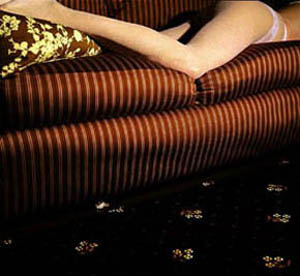
In "Lurkers and Rogues," Kingsley often looks closely at a single object, person, or fragment, as if to signify perception's privileged moment. A butterfly hovers at the edge of low-rise jeans, along with some awkwardly protruding flesh. She also makes explicit use of her large format to create juxtapositions between solid objects and decorative materials. A pair of legs rests on the cushions of a sofa, a knife blade divides the stick of butter on a table, or a branch of dogwood, outlined against a red wall, hangs over a head of dark hair. In each case, the three-dimensional object comes with strong, even dangerous tactile associations, but the surface may well hold the greater sensual charge and permanence. I hope that Chelsea still has room for either one.

Jon Kessler at MoMA PS1 through February 4, 2005, David Ivie at Elizabeth Harris through November 12, 2004, Catherine Sullivan at Metro Pictures through January 21, 2005, Reynold Reynolds and Patrick Jolley at Roebling Hall through January 7, 2005, James Hopkins at Rivington Arms through October 22, 2004, Daniel Rozin at Bitforms through October 15, and Diana Kingsley at Leo Castelli through October 2. These shows largely coincided with Mike Kelley at Gagosian through December 17, 2004, which now has its own review, as part of a 2013 retrospective at MoMA PS1.


