4.29.24 — Bright Lights, Black City

Mary Lovelace O’Neal left her teaching job at Berkeley in 2006, for a studio in Mexico. It would not be my choice, but she can stand the heat. She can always retreat in her imagination to New York at midnight, when the sky is black and everything is cool.

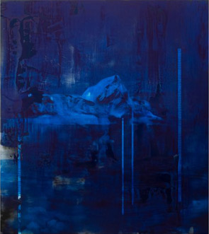
Black for her is definitely a color, and it animates some lively figures darting across the night as well. Just to speak of it as her ground belies how light they are on their feet. It embodies her own blackness as well. Mary Lovelace O'Neal's Rooftops Where Women and Cats Rule (Marianne Boesky gallery, 2021–2013)

Her latest, at Marianne Boesky through May 4, includes Round Midnight, after Thelonius Monk in jazz, and Bright Lights Big City—and do not so much as think of the once fashionable novel of that name, about white hipsters in the 1980s taking big money to Tribeca nights. This is the big city of the blues and of rolling in my baby’s arms. It is the city of Manhattan and of Rooftops Where Women and Cats Rule. Even in her eighties, that means her. Yet her show is “HECHO EN MEXICO—a mano,” or made in Mexico by hand, and her hand has never been more visible. It helps that she starts with black and that her acrylic looks a lot like drawing.

Lovelace O’Neal started to apply lampblack as a student at Colombia, with a blackboard eraser. Even then, she was changing the rules. That kind of black is left over from burning, but now it became a place to begin, and an eraser was laying down rather than cleaning up. Echoes of the blackboard appear again with white curves that look like chalk. They can stand for anything from shoelaces to long hair, although they may look like graffiti or accidents. Like graffiti, too, they can produce text now and then, like a tag—this time out, for Little Black Sambo’s Green Coat.

She can be more consistently colorful and painterly, as with her whales, featured in the 2024 Whitney Biennial (and a concurrent show runs at SF MOMA). That and her mural scale make her an heir to postwar abstraction. Here, though, that leaves plenty of space for black. The show has just eight works, but they run up to four panels across. As with Raymond Saunders, black sets off layers of bright color, which then acquire more black as figures in action. They can be human, animal, or both at once, charming enough for cartoons, but do not dare call them cute.

So what's NEW!She is as hard to pin down as her location. Born in the South, she refused to become a southern artist, and after Colombia she left for the West Coast. She had a residency in Morocco, a term with a print collective in Chile, and a stop back in New York for a print studio run by Robert Motherwell. Like Kara Walker, Lovelace O’Neal trades in African American stereotypes, only to take them apart. Little Black Sambo, now with a woman’s braids or tresses, lies on her black, weighed down by that green vest. It might be the heavy kind used as protection from x-rays. She might be doing everything she can to remain on the margins, and she has shown only rarely in New York, or she may simply identify with black artists as outsiders.

How she keeps New York in mind is beyond me, but it helps that she also keeps her edge. The jagged edge of color brings an edge, too, to the black ground. If color becomes a figure or a layer of pure painting, fine. That cat-woman faces down a purple cat that could be anything at all. Her featureless black face could belong to anyone or any gender as well. She has her stylish clothing or body armor in bright red—and a wound of red on yellow across from her absent heart.

Read more, now in a feature-length article on this site.

4.26.24 — Survivors

Si Lewen was a survivor, and the price of survival was to relive the Holocaust again and again. It was a price he was more than willing to pay.

Lewen relived it sixty-three times in one work alone, the drawings of The Parade—and again in the canvases that he called his Ghosts. A parade can itself mean a procession of events from which there is no escape, like a parade of disasters, his gallery compares Ghosts to shrouds, at James Cohan through April 27. The very fact of repetition can characterize a nightmare, much as Arthur Jafa replays the horrific final shootings in Taxi Driver in his latest video. MutualArtAnd the Holocaust was a nightmare if there ever was one, from which Jews like Lewen are still trying to awake. Yet he was a survivor, again and again, and he took it as his chance to take history back from those who killed. If it can be hard to separate willingness from compulsion, he knew what he wanted.

Art Spiegelman met him as a survivor, at age ninety-four, as comfortable as he could possibly have been with his memories. Spiegelman called him “a dynamo: a charming and elfin man, frail but bubbling with enthusiasm, wry humor, and unorthodox opinions. The younger man had come upon The Parade long before and must have felt it as a calling. It has the wit and brutality of his own account of the Holocaust in black and white, Maus, still years away. Its harsh lines and repeated elements anticipate the sheer existence of a graphic novel, in an unnerving mix crayon, ink, pencil, and paint. If a cartoon version of the Holocaust sounds like a sacrilege, neither man was joking.

Lewen had to keep reinventing himself to survive. He escaped Poland as a child and then Germany before it was too late. He joined the U.S Army rather than flee to safety, in a unit that valued his fluency in German language and culture. He participated in the liberation of Buchenwald without flinching, and he saw no need to put the events behind him once and for all. He took up a career that ties observation to action, as an artist. In one last reinvention, the Jew spent his last years in a Quaker home for the aged, where Spiegelman rediscovered him, four years before his death in 2016.

Si Lewen's Untitled (The Parade) (James Cohan gallery, c. 1950)There nobody was marching anymore, but Lewen had lived for the parade. Much of his talent lies in riffing on that theme. He shows a pathetic excuse for a parade, with a German on horseback, and goose-steppers, again parallel to the picture plane. He shifts into depth for a very different procession, of men bearing the weight of coffins, but the parallels are inescapable. Perhaps some of the same victims face out from behind barbed wire, their hunger and terror not yet assuaged by the Americans they witness. This is the pageant that the Nazis demanded but could not control.

Repetition characterizes Ghosts as well, but the dead and living all but vanish. They become a patterning of hash marks within diamonds, with a pattern of their own. They link the series to the jagged line of German Expressionism on the one hand and to the Minimalism of his time in painting on the other. They amount to abstract art (and portions of The Parade approach abstraction as well), but as realism’s ghosts. Still larger work, spanning five panels, screams at the horrors of war like Francisco de Goya. Like the drawings as well, this could be a graphic novel rather than fine art, but not for want of care or provocation.

Two doors down in the gallery’s street-level space, Kaloki Nyamai, too, is and his not playing around, through May 4. He fits with other artists who are working not with African American life or the Afro-Caribbean diaspora, but a return to Africa. Nyamai paints Kenyans at work and play, but it is hard to tell the difference—or to separate figures in action from assorted body parts. Both float in a sea of scribbles and scumbles on acid blue and yellow ground, as Twe Vaa, or “we are here.” He could be asserting his own sense of home or the existence of a people. Either way, you are there, unless you are lost as well.

4.24.24 — Abstraction in Focus

To pick up from last time on the fate of abstract art, sixty years ago two views of painting faced off. You know them well. Art had to be big, bold, and new, the mark of the artist on a scale that no one gesture could ever comprehend. Or art had to be rigor, geometry, and object, where, people said, what you see is what you get.

Of course, the second is the point of view of Minimalism and post-painterly abstraction, the first of color-field painting, but the argument and the tension go back further still, to Abstract Expressionism itself. And then, too, there was a third point of view. Who needs all that anyway, when pop culture, political action, and sexual politics could see right through them all? Trudy Benson's Computer Painting (Horton, 2013)You can take sides and choose your champions—Jackson Pollock or Lee Krasner, Frank Stella or Agnes Martin, Andy Warhol or Philip Guston, physical art or conceptual art, or the women and blacks they so often forgot, and this Web site has covered them and many more. Were the first two points of view all that different anyway? Both call for retaining the artist’s signature while effacing the artist, and both call for paint.

Now, though, artists can have it all. They can run through geometry and gesture, like a catalogue of painting in a single work. They can merge and disturb “pure painting” and figuration. A woman’s body reappears, but this time in the hands of women. Can anything still stand out? Consider some who still try—like Trudy Benson, Michael Reafsnyder, Andrea Belag, and, in a separate post, Grace Carney (and I bring this together with that separate post as a longer review in my latest upload.

Trudy Benson could figure in anyone’s tour of the possibilities, with her own expanding catalogue. She has turned to mixed media and offered up her Computer Painting before AI art threatened to take away her job—and here she is again with her own hand, at Miles McEnery through May 11. Thin curves of thick paint weave across the surface, atop brightly colored rectangles. Frank Stella quipped that he only wanted to make his paints look as good as when just squeezed from the tube, and Benson may have taken him up on the squeeze. Beneath them all, tight arrays of rectangles define and distort the grid—like curved sheets in space or curved space itself. The successive layers pop right out of the picture plane, float within it, and undermine it.

At the same gallery a few doors down, Michael Reafsnyder has his own shifting foundations, but right up on the surface. He also has no need for a catalogue in order to say it all. Like David Reed, he can make a brushstroke look like a brushstroke. White mixes into black in shifting proportions, like highlight and shadow. Acrylic has changed a great deal in fifty years, and one no longer needs oil to capture the light. It can reflect light as well, like resin, in more polished black.

Intermixing adds raw color as well, seeming to emerge from blackness and a greater depth. Whether you call this illusion is up to you. The layers of paint are real. These are large, tall paintings in the manner of art from the 1950s, with the focus on paint as both physical and visual. There is no one motif apart from the entire surface. If artists once left their signature, in floating rectangles and drips, Reafsnyder effaces it.

Is he still trying to say it all, without an index or catalogue? A third artist has no need to try, and her work is all more impressive for that, just last month at Steven Harvey through April 13. Andrea Belag does have her signature motif—and, as with the older generation, it arises from painting broadly and paring back. Arcs in simple, bright colors capture the eye and center a painting. They could even stand for the eye, from their shape and their access to the artist’s vision. She has her focus, and that will have to do.

Belag works just larger than many an easel painting, but that, too, is part of her focus. In fact, she shares her scale with target paintings by Kenneth Noland and recalls his signature. She makes direct reference to another painter with a fondness for curves as well. This show is “Twombly’s Green,” after Cy Twombly. She does not, though, restrict her choices to green and she is not doodling. Rather, she is mixing and layering curves the width of a brushstroke, leaving plenty of off-white ground.

Additional paint in the space beneath the arc has a layer to itself below and beneath, like a solid plate. It could be what the eye sees. Regardless, color and focus still matters: maybe the first generation of postwar abstraction was not so bad or so dogmatic after all. At the very least, its turn to color-field painting came about from women like Helen Frankenthaler. Whether the present generation of “anything goes,” dogma, and diversity can have the same impact remains to be seen.

Read more, now in a feature-length article on this site.
4.22.24 — Big Girls

Grace Carney cannot get enough of women. Her show’s title insists on it, thrice over, with “girlgirlgirl.” You just may not notice them right away or see them all at once, at P.P.O.W. through February 24, and excuse me for another late post. She deserved your and my fuller attention.

Her stained colors command attention all by themselves, at least for a moment, and continue to reward attention after that. They recall an era when color-field painting alone sufficed to go big. Still, they temper their breathless good cheer with female bodies in the present. They invite one to ask when drawing becomes painting and flowing paint becomes drawing once again. Grace Carney's Oh Me (P.P.O.W., 2023)

More and more galleries have been pursuing diversity by looking back. They keep returning to postwar abstraction and the women who made it, all the more so if those women suffered neglect along the way. Just this year, a gallery called its winter group exhibition “Perseverance.” What sets these artists apart, and can gender alone explain their neglect? After all, Joan Mitchell and Helen Frankenthaler made history while inventing color-field painting, taking Abstract Expressionism to a new level, and historians have taken note just fine. After all, too, trends do become stale, so why look back?

A little skepticism is all the more important when the artist is not neglected but just breaking through. Carney, now at a Tribeca gallery with a history of its own, received her MFA as recently as 2022. One could almost read the show’s title as “You Go Girl.” Is the going now easy? At what point does the back and forth between realism and abstraction become itself a cliché, a means of mythmaking twice over? Carney, though, sees them as far more than myths.

The artist combines lots of color with ample white space, giving her shapes room to expand. Pours and brushwork themselves expand outward in translucent swirls. They suggest Morris Louis, but the light colors never run together to the point that they become his darker veils, and symmetry is out of the question. Carney is asking not for late Modernism’s rigor but only its paint. Her overlapping marks violate an older generation’s demands for both flatness and space. They have to do so, to let the images emerge as women.

She is just as serious about the body. She treats big girls not, as so often in painting now, as characters in a mythic narrative, but rather as figure studies. They twist and turn freely, as if to hide, although faces appear as well. Their closeness to the picture plane may come closest of all to Joan Semmel in her nineties. Maybe Carney is not satisfied with the appeal of the emerging artist after all. I look forward to what comes next, after the good cheer is gone.

Eddie Martinez masks everything about his figures but their faces, as “Wavelengths,” at Mitchell-Innes & Nash through March 9. His Whiteouts start with group portraits in the Brooklyn community he knows best, much like Henry Taylor. Then he paints over them, like his Flower Pots, with plenty of white. White can surround a face like a halo. Black and color still peek through, in a contrast that recalls the youngest of the old Abstract Expressionists, Richard Pousette-Dart, as much as acts of erasure. They express the effacement of people of color, but also their pleasure in just hanging out.

Read more, now in a feature-length article on this site.

4.19.24 — Birthing Feminism

Judy Chicago ends her retrospective with other women. It could hardly be otherwise, when her best-known work, The Dinner Party, relied on the assistance of four hundred. With its place settings for thirty-nine more, it sought to span recorded history as well.

No surprise, then, if she devotes a full floor of her retrospective to women across the centuries and across the arts, at the New Museum. It could hardly be otherwise, when she titles it “Herstory,” through March 3. And yes, it is shameful that I am posting this late, but at least the review in full was always online.

Judy Chicago's The Birth Project: In the Beginning (detail) (courtesy of Judy Chicago/ARS, 1982)For her, a women’s history is not just recovered but created again each time, and so is art—not as a male saga of lone genius, but as a collaboration. She reserves a place for goddesses as well as humans as well. She keeps coming back, too, to acts of birth. Will women still recognize it as their own? I have my doubts. If you ask me, art and activism need not more primordial women, but fewer male gods.

New York was not new to her in 1980, when The Dinner Party reached the Brooklyn Museum. (It later found a permanent home at the museum, as anchor to its Sackler Center for Feminist Art.) She and her first husband had hitchhiked to New York in the 1960s, living briefly in Greenwich Village. Still, she felt new to New York. She left a personal stamp on feminism, one that not everyone could accept but many have loved—one rooted in primordial beings and present-day sex organs. For a fuller answer, I work a longer version of this review together with a recent earlier report on Shahzia Sikander as my latest upload.

I have my qualms about questioning either one. It aligns me with conservative critics like Hilton Kramer of The New York Times, who trashed her back then along with pretty much all postwar American art. It puts me, a white male, in the position of speaking for feminism when I hope to support it. And Chicago’s retrospective does offer a greater diversity, including the glassware, ceramics, and embroidery of those place settings. She deserves credit, too, for founding the Feminist Art Project at Cal State Fresno and later, with Miriam Schapiro, at Cal Arts. Still, whatever her history or herstory, she is always at its center.

Banners hang over The City of Women, that floor-scale installation, with one in particular flying high, What If Women Ruled the World? And here they do rule, but at a cost. You will spot paintings by Hilma af Klint, Sophie Taeuber-Arp, and Georgia O’Keeffe, amid less-compelling models for Symbolism and Abstraction. You will spot those who refuse to be reduced to “significant others,” like Dora Maar (for Pablo Picasso), Frida Kahlo (for Diego Rivera), Leonora Carrington (for Max Ernst). You will spot Käthe Kollwitz next to Martha Graham, with an eye to how women pose, and painters near books and photographs of writers, with labels you may never find. For all its wonders, it eradicates differences and reduces everyone.

Even so, Chicago keeps demanding more. She took the Feminist Art Project seriously. Her classes became Womanhouse—collaborations with her chosen students, with their everyday lives as performance art, and she credits the resulting film and photographs to them and not to herself. She does not abandon spray paint and lacquer, now on vinyl on canvas. Still, in adopting a radial motif and at times ceramics, she is well on her way to the strengths and weaknesses of The Dinner Party. I may not like it, but it anchors the Sackler Center and the feminist revolution to this day.

Embroidery and collaboration carry over to the Birth Project of the early 1980s, with at least one hundred fifty women to execute the needlepoint. Colors darken, but not for long. Men get their project, too, but with articulated musculature and grimaces that had me grimacing as well. Still, she adopts the translucency of stained glass for her Rainbow Shabbat of 1992. She also collaborates with her present husband, Donald Woodman, on a larger Holocaust project and, in New Mexico, a co-ed follow-up to Womanhouse. Women’s roles have become gender roles in a racially torn America.

Chicago gets all three principal floors, including the last for her city of art and women. If you happen to begin there, so much the better. It makes clear how much her hopes do not depend on birthing. She herself never bothered with motherhood. As she told The Guardian, “There was no way on this earth I could have had children and the career I’ve had.” Her work is still tacky, sentimental, and reductive, but she gave it her all.

Read more, now in a feature-length article on this site.

4.17.24 — The Poetry of LA

Cauleen Smith could have even a New Yorker nostalgic for Southern California. That may sound like a tall order, although the sensation may last all of fifteen minutes, but Smith will make you feel right at home, recently at 52 Walker. And I work this together with a recent report on immersive video by Mary Lucier as a longer review and my latest upload. Smith, too, shows how a multichannel video can and cannot encompass a life, but will one fall for the illusion or pierce it? Is this really the video of a lifetime?

Cauleen Smith's The Wanda Coleman Songbook (David Zwirner/52 Walker, 2024)Smith sets out plush sofas—so comfortable that you may get up only to be sure that you have caught all four of the installation’s projections. Throw rugs can hardly cover the upscale Tribeca gallery (aka David Zwirner), but then what could? Besides, you know what people say: everyone out there is famous for fifteen minutes.

That includes Wanda Coleman, and Smith, who appeared in the 2017 Whitney Biennial, is out to extend the late poet’s moments of fame. The filmmaker is nostalgic not just for the city of her childhood, to which she has at long last returned, but also for a black woman who loved music almost as much as words. This is The Wanda Coleman Songbook, through March 16 (and apologieas for the late post while I catch up a bit), and you get to play DJ. You will just have to trust the gallery that Coleman, who died in 2013, earned a reputation as the poet laureate of Los Angeles. Her name may not mean much to a New Yorker, but then neither might this view of the great city without a city. This is LA as itself poetry but oddly remote from life.

Smith, who is African American, does not quite efface the urban core that many blacks call home, but she does relax and enjoy it. She treats the film’s multiple channels as an immersive experience. Two projections cover the facing long walls, the other two the alcoves to either side. Besides the sofas and rugs, she includes a coffee table for Coleman’s books and a quaint countertop with a good old turntable, where the songbook in question plays along. Smith commissioned music for the five tracks of an EP. Now she invites visitors to place the needle and to listen.

An EP may seem like a letdown or a rarity for those nostalgic for LPs, but this one is itself art. It comes in pink vinyl with splotches of bright red. I am tempted to say blood red, but in the installation’s spirit it might be better to think of candy canes and melted strawberry ice cream. Coleman also went by the name LA Blueswoman, but only some of the tracks are bluesy. All are as close to background music as the projection. It could be a direct retort to the California of Ed Ruscha.

Where Ruscha goes heavy on irony and detachment, Smith is sincere and totally involved. Where he photographed Every Building on the Sunset Strip, she is seemingly random but also selective. She cuts among sunsets, palms, utility poles and a railroad crossing, where she waits like anyone else for a train to pass before she can move on. The building on the far side has its share of graffiti, but she does not see it as defacement. Even the region’s bane, traffic, looks charming from overhead on a highway at night. Segments may rush past, but they feel slower and longer, like those proverbial fifteen minutes of fame. Poverty and luxury alike are nowhere in sight.

So much else is surely missing, not least the poetry. Coleman’s words appear on-screen now and then, but difficult to read, and aloud on vinyl, but just as difficult to hear. Is there a dark side? Three cut-outs leave their silhouettes on the walls, as more utilities and a creepy mask. Still, in a fourth projection, outstretched fingers like an ILY (I Love You) sign spell LA. As you head off to the gallery scene, downtown restaurants, and an overcrowded Canal Street, that sign-off, too, will soon be gone.

Read more, now in a feature-length article on this site.

Older Posts »